Chapter2 Transformations
Chapter Aim: To illustrate the role of transformations in analysing non-normal, non-linear data and to introduce the use of maximum likelihood.
2.1 Introduction
At the risk of being somewhat repetitive, the assumptions about the observations \(y_i\) for conventional linear model analysis are:
\(E(Y_i) =\boldsymbol{\beta}^T \boldsymbol{x}\) is a function that is linear in the parameters.
var\((Y_i)= \sigma^2\) (constant variance).
\(Y_i\) has a normal distribution.
\((x_i, y_i)\) are mutually independent observations.
It is surprising how often a single transformation can move a data set some way towards satisfying all these assumptions. Indeed an intelligent use of transformations can provide an adequate, if not optimal, analysis of most data.
The first example is intended to demonstrate the dual role of a transformation as a variance evener as well as a curve straightener. It is an example in which the transformation is suggested by the biological models.
2.1.1 Example: Predicting salmon recruits from the spawners the previous year
Biological discussion
This data set comes from a Canadian study (Ricker and Smith 1975) quoted on page 140 of (Carroll and Ruppert 1988). In the following example, S is the size of the annual spawning stock and R is the number of catchable-sized fish, or recruits. See Figure 2.1 for a plot of the data.
    data(Salmon, package="ELMER")
Salmon |> ggplot(aes(y=Recruits, x=Spawners)) + geom_point() +geom_smooth(method="lm")
`geom_smooth()` using formula = 'y ~ x'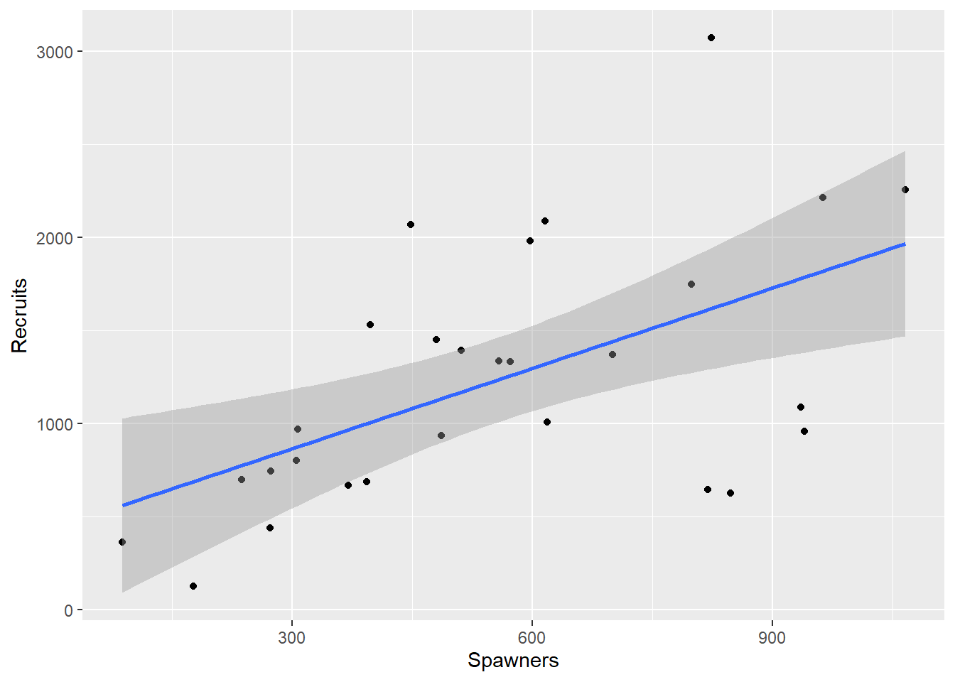
Figure 2.1: Plot of the Salmon data
Data from ecological studies are often as scattered as this, but they are nevertheless useful because the questions asked are often as broad as ‘What happens if the population doubles?’ Frequently the form of the equation can be predicted on biological grounds, which in effect increases the amount of information available. In this case there are two suggested equations: \[\begin{equation} R = \beta_1 S \exp(-\beta_2 S) \tag{2.1} \end{equation}\] where \(\beta_1,\beta_2 \geq 0\), or \[\begin{equation} R= \frac{1}{\beta_1 + \beta_2 / S} \tag{2.2} \end{equation}\] where both \(\beta_1,\beta_2 \geq{} 0\).
These models differ in their broad biological consequences. Both imply that \(R \rightarrow 0\) as \(S \rightarrow 0\), which is to be expected. Both also imply that R has a maximum, but Equation (2.1) has this maximum reached when \(S~=~1/\beta_2\), and then \(R \rightarrow 0\) as \(S \rightarrow \infty\). In other words the increasing number of juveniles causes such competition that the number reaching catchable size actually decreases. Equation (2.2) also has a maximum, but implies that this maximum is reached asymptotically as \(S \rightarrow \infty\). Both of these models are deterministic. They say nothing about the variability. The straight line shown in Figure 2.1 might well fit the data as well as either of Equations (2.1) or (2.2), but its implication that recruit numbers could be increased indefinitely is unrealistic.
Discussion of what to fit and how well it fits
From the plot of the data in Figure 2.1 we can see one unusual observation. In 1951 a rockslide severely reduced the number of recruits, so this observation will not be used in the analyses that follow.
  Year Spawners Recruits
1 1951 176 127Rows: 27
Columns: 3
$ Year <int> 1940, 1941, 1942, 1943, 1944, 1945, 1946, 1947, 1948, 1949, 1…
$ Spawners <int> 963, 572, 305, 272, 824, 940, 486, 307, 1066, 480, 393, 237, …
$ Recruits <int> 2215, 1334, 800, 438, 3071, 957, 934, 971, 2257, 1451, 686, 7…As a basis for comparison a straight line is fitted, but primary interest lies in the two biological models. They can both be linearized. From Equation (2.1): \[\begin{equation} \begin{aligned} R&=& \beta_1 S \exp(- \beta_2 S) \nonumber \\ \ln R & =& \ln \beta_1 + \ln S - \beta_2 S \nonumber \\ \ln (R/S) &=& \ln \beta_1 - \beta_2 S \end{aligned} \tag{2.3} \end{equation}\] In this expression, the log of the ratio \(R/S\) is linearly related to S.
From Equation (2.2): \[\begin{equation} \begin{aligned} R &=& \frac{1}{\beta_1 + \beta_2 /S} \nonumber \\ \frac{1}{R} &=& \beta_1 + \frac{\beta_2 }{S} \end{aligned} \tag{2.4} \end{equation}\] This model suggests the reciprocals are linearly related. Alternatively for Equation (2.2) \[\begin{equation} \frac{S}{R}= \beta_1 S + \beta_2 \tag{2.5} \end{equation}\] In this expression, the ratio S/R is linearly related to S.
We therefore have three statistical models to investigate, shown in Figures 2.2 to 2.4, using their transformed scales; the scale in which they are assumed to have constant variance.
    NewSalmon  <- NewSalmon |> mutate(Ratio = Spawners/Recruits)
    Model1 <-lm(Ratio~Spawners, data=NewSalmon)
    NewSalmon  |> ggplot(aes(x=Spawners, y=Ratio)) + geom_point() + geom_smooth(method="lm") + ylab("Spawners/Recruits")
`geom_smooth()` using formula = 'y ~ x'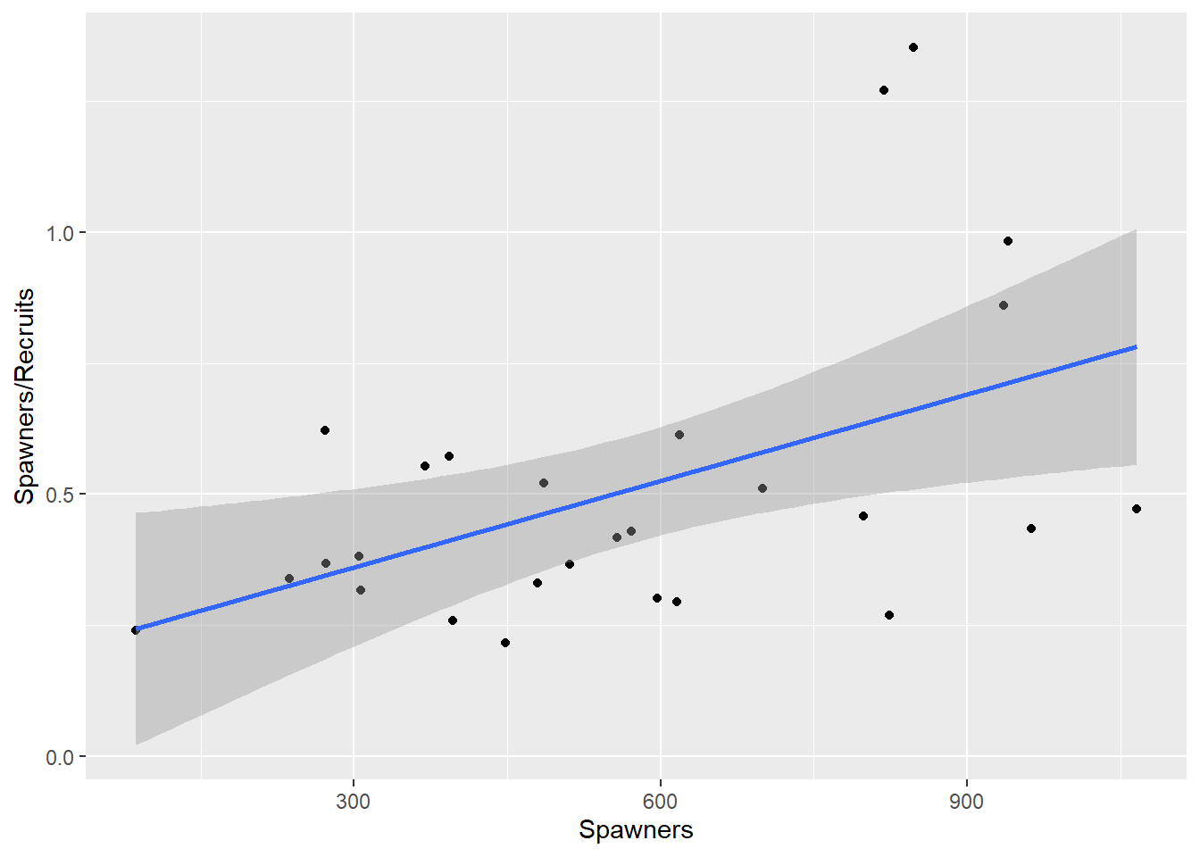
Figure 2.2: Regressing the ratio of recruits to spawners, on spawners.
    NewSalmon <- NewSalmon |> mutate(InvR= 1/Recruits, InvS=1/Spawners)
    Model2<-lm(InvR~InvS, data=NewSalmon)
    NewSalmon |> ggplot(aes(x=InvS, y=InvR)) +  xlab("1/Spawners") + ylab("1/Recruits") + geom_point() + geom_smooth(method="lm")
`geom_smooth()` using formula = 'y ~ x'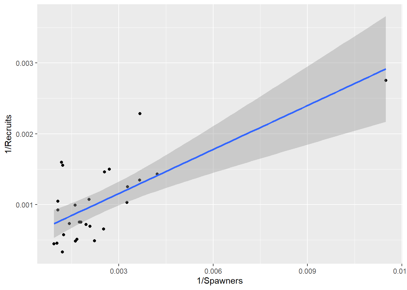
Figure 2.3: Regression of the reciprocal of recruits on the reciprocal of spawners.
This is not data for dogmatic judgments, but the model in Figure 2.4 (Equation (2.3)) looks best.
NewSalmon = NewSalmon |> mutate(LnRatio= log(Recruits/Spawners))
Model3<-lm(LnRatio~Spawners, data=NewSalmon)
NewSalmon |> ggplot(aes(x=Spawners, y=LnRatio)) + ylab("ln(Recruits/Spawners)") + geom_point() + geom_smooth(method="lm")
`geom_smooth()` using formula = 'y ~ x'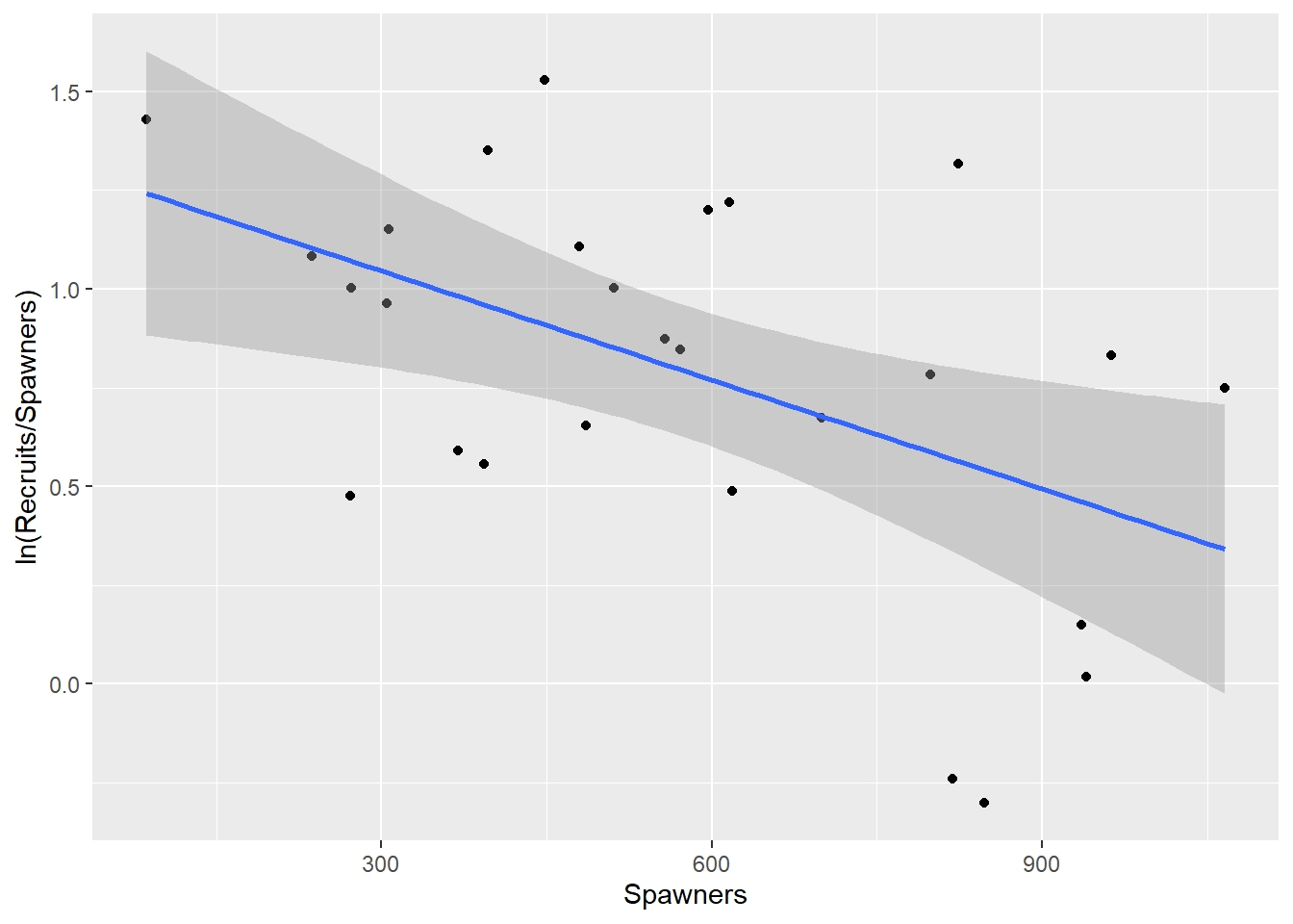
Figure 2.4: Regression of the log of the ratio of recruits to spawners, on spawners.
We really want to see the models back on the original scale. Some manipulation of the fitted values is needed to do this, but the (overly) simple linear regression and these three models are all presented in Figure 2.5 for comparison.
    NewSalmon |> ggplot(aes(y=Recruits,x=Spawners)) + geom_point() +geom_smooth(method="lm") +
geom_smooth(aes(y=1/(fitted(Model1)/Spawners)), lty=2, col=2, lwd=1) +
geom_smooth(aes(y=1/fitted(Model2)), lty=3, col=3, lwd=3) +
geom_smooth(aes(y=exp(fitted(Model3))*Spawners), lty=4, col=4)
`geom_smooth()` using formula = 'y ~ x'
`geom_smooth()` using method = 'loess' and formula = 'y ~ x'
`geom_smooth()` using method = 'loess' and formula = 'y ~ x'
`geom_smooth()` using method = 'loess' and formula = 'y ~ x'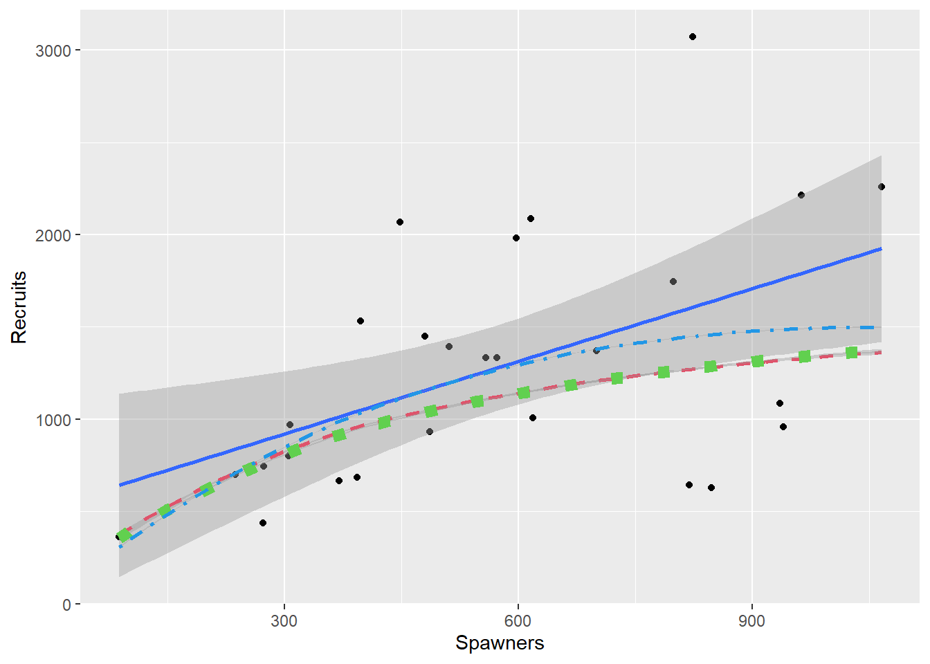
Figure 2.5: All models fitted to the Salmon data
As would be expected Equations (2.4) and (2.5) are very similar, but they are not exactly the same. They differ in just what is assumed to have constant variance, and points in Equation (2.4) are given different weights from points in Equation (2.5). This is seen by the graphs in Figure 2.6 which shows what a constant variance for the transformed equation translates to in the original data. The curves are found by both adding and subtracting twice the respective model’s standard error to the fitted values for the transformed data and back-transforming the resulting lines. Note that use of this constant is shown for illustration and is not the method for producing confidence or prediction intervals.
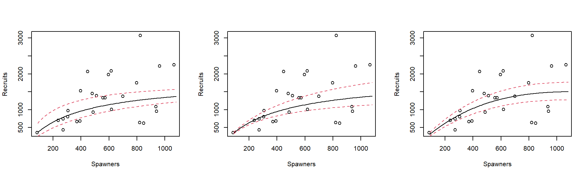
Figure 2.6: Fitted values and lines representing two standard errors above and below the fitted values, all backtransformed onto the original raw data scale.
The models given in Equations (2.3) and (2.4) with variability which increases with S, look sensible. The simple linear regression model (Equation (2.1)) would have parallel lines, of course, which is not what the scatter plot suggests. However the model built on Equation (2.5) is even worse, because it implies that the variability decreases.
Note that all four models fit the mean quite well - at least none of them could be rejected. It is however necessary to model the variability as well as the mean, and on this basis either of the models from Equations (2.3) or (2.4) would be chosen.
2.2 Discussion of residuals
The mathematics of regression diagnostics is not an important part of this course. However, so that you know what the words mean when they are produced by a computer program, here are some general notes.
Information about variability comes from the residuals. In recent years a considerable amount of research has been published examining new ways of using residuals, most taking advantage of computing power. Three common types of residual are defined here for reference purposes.
Raw residual \[\begin{equation} \tag{2.6} r_i= y_i - \hat{y}_i \end{equation}\] found using the
resid()command.Standardized or Studentized residual \[\begin{equation} \tag{2.7} r_i^\prime = \frac{y_i - \hat{y}_i}{ s.e. (y_i - \hat{y}_i)} \end{equation}\]
Deletion or externally studentized residual \[\begin{equation} \tag{2.8} r_i^* = \frac{y_i - \hat{y}_{(i)} }{s.e. (y_i - \hat{y}_{(i)} )} \end{equation}\] where (i) indicates that the prediction \(\hat{y}_{(i)}\) and the variance estimate used to find the standard error \(s.e.(y_i - \hat{y}_{(i)} )\) have been estimated by omitting the ith observation from the analysis.
The raw residuals have the disadvantage that they do not all have the same variance, the variance of \(\hat{y}_i\) depending on how far \(x_i\) is from the mean. Since plots of residuals are examined for signs of trends in the variance this effect, although usually small, should be eliminated by using the residuals that are standardized according to the weights used in the model.
An alternative to the raw or standardised residuals is the deletion residual. These answer the interesting statistical question, Does the observed \(y_i\) agree with the prediction \(\hat{y}_{(i)}\) which arises when the ith observation is not used for fitting? If all the linear model assumptions hold, each deletion residual will follow a t-distribution because \(y_i\) is independent of \(\hat{y}_{(i)}\) and the standard error. If deleting a point has a big influence on a model the predictions will change markedly when it is deleted. This is the basis for a Cook’s statistic for measuring the influence of a point.
\[\begin{equation} \tag{2.9} D_i = \frac{(\hat{y}_{(i)} - \hat{y}_i)^2}{ps^2} \end{equation}\] where p is the number of parameters in the model. There are also modified Cook’s statistics and DFITS which are minor variants of the \(D_i\)’s.
Figure 2.7 compares the raw residuals to the deletion residuals, for the Models 1 and 3 (Equations (2.3) and (2.5) respectively).
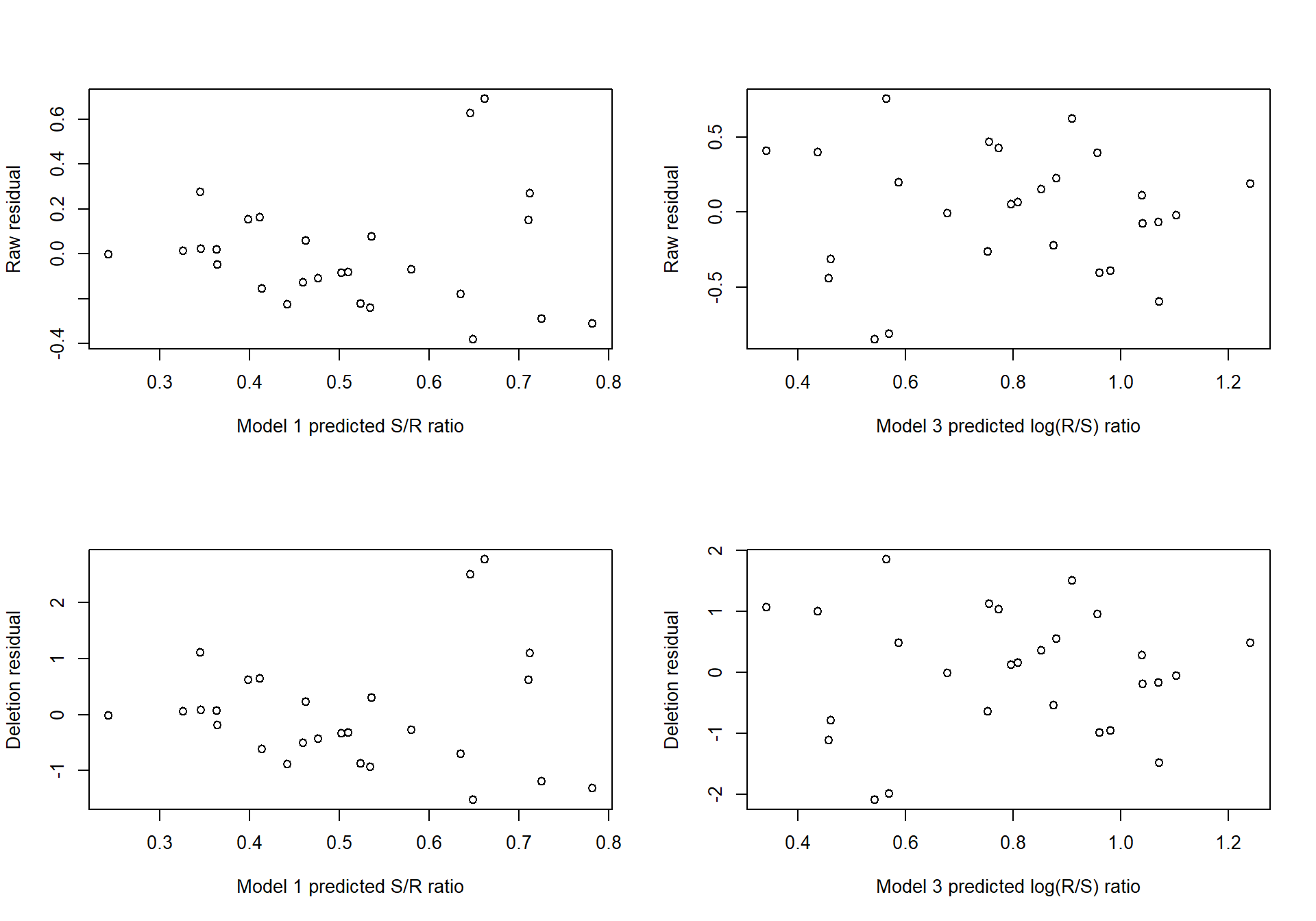
Figure 2.7: Raw and deletion residuals for two models fitted to the Salmon data.
For each model, the pattern of raw residuals is very similar to that of the deletion residuals, indicating that no single point has special influence. Overlaying the points (on the same standard scale) would highlight the similarity of these patterns.
An influential point will either be an outlier (have a y value distant from its prediction) or have high leverage (have an \(\boldsymbol{x}\) value distant from the other \(\boldsymbol{x}\) values). These are the points which diagnostics are intended to uncover. A model that included the data from 1951 would (hopefully) show this year to have an influential observation.
2.3 A Family of Transformations
Ideally the physical or biological theory will suggest a model to try, which then in turn might suggest suitable transformations. However if the data is a little less scattered than it was in Example 2.1.1, it might suggest a transformation itself. Something more systematic than a ‘Try every transformation you can think of’ approach is desirable. (Box and Cox 1964) suggested a family of transformations based on powers: \[\begin{equation} \tag{2.10} y^*(\lambda) = \frac{y^\lambda -1}{\lambda} \end{equation}\] if \(\lambda\ne 0\) or \(y^*=\ln y\) if \(\lambda=0\).
The clever point about this transformation is that it includes all powers (e.g. reciprocals (\(\lambda=-1\)) and square roots (\(\lambda=\frac{1}{2}\)). It also incorporates \(\ln y\) — only a little mathematical analysis is required to show that as \(\lambda \rightarrow 0\), \(y^*(\lambda) \rightarrow \ln y\). In other words \(\lambda\) can be changed smoothly to encompass a whole range of transformations.
2.3.1 Example: Wool data
We use data from an industrial experiment as presented by (Box and Cox 1964). It relates the number of cycles before failure of a worsted yarn under cycles of repeated loading to three factors:
x1: length of test specimen (250, 300, 350 mm)
x2: amplitude of loading cycle (8, 9, 10 mm)
x3: load (40, 45, 50 g)
You may recognise that it comes from an experiment where the treatments form a 33 factorial structure, which means that there is one observation for each of the 27 combinations of the three factors at three levels. Data from experiments like this have some simplifying properties. For example because every level of each factor appears with every level of each other factor the three x vectors are mutually orthogonal and the estimates of their coefficients are independent. However this should not make any difference to the process of finding the best fitting model. Before looking at transformations we will examine a common computing strategy.
2.3.2 Standard ANOVA discussion
The common strategy of industrial experiments is to try adding quadratic and interaction terms (called second order terms) to the model until the fit is satisfactory. Standard programs for the analysis of experiments make this procedure easy, providing F-tests for each term automatically. The results for first-order and second-order models are shown below, with residual plots in Figure 2.8.
    library(rsm)
    data(Wool,package="ELMER")
    Wool.rsm1=rsm(Cycles~FO(Length, Amplitude, Load), data=Wool)
    Wool.rsm2=rsm(Cycles~FO(Length, Amplitude, Load) + TWI(Length, Amplitude, Load),  data=Wool)
    Wool.rsm3 = rsm(Cycles~SO(Length, Amplitude, Load),  data=Wool)
anova(Wool.rsm1, Wool.rsm2, Wool.rsm3)
Analysis of Variance Table
Model 1: Cycles ~ FO(Length, Amplitude, Load)
Model 2: Cycles ~ FO(Length, Amplitude, Load) + TWI(Length, Amplitude,
Load)
Model 3: Cycles ~ FO(Length, Amplitude, Load) + TWI(Length, Amplitude,
Load) + PQ(Length, Amplitude, Load)
Res.Df RSS Df Sum of Sq F Pr(>F)
1 23 5480981
2 20 2068421 3 3412560 15.39 4.3e-05 ***
3 17 1256681 3 811740 3.66 0.033 *
---
Signif. codes: 0 '***' 0.001 '**' 0.01 '*' 0.05 '.' 0.1 ' ' 1par(mfrow=c(1,2))
plot(fitted(Wool.rsm1), resid(Wool.rsm1), ylab="Residual", xlab="Fitted values")
abline(h=0)
plot(fitted(Wool.rsm3), resid(Wool.rsm3), ylab="Residual", xlab="Fitted values")
abline(h=0)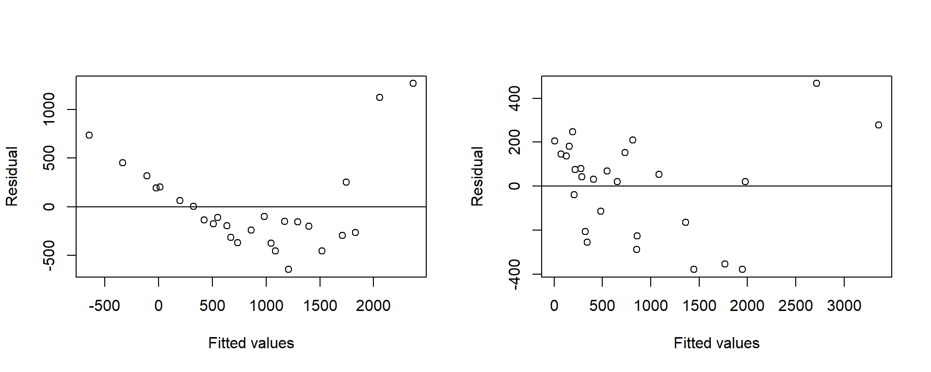
Figure 2.8: Residuals from the first and second order models fitted to the raw response for the Wool data
Even with the six second-order terms the residual plot looks unsatisfactory. The problem is that the response is in the wrong scale.
2.3.3 Box-Cox Transformation discussion
The Box-Cox transformation given in Equation (2.10) can be fitted for a range of values of \(\lambda\). It would be unusual for \(\lambda\) to lie outside the range -2 to +2. Some programs use a slider whose value can be changed continuously by dragging a pointer over a scale. As the value changes all the analyses and plots using the variable also change. By setting up \(\lambda\) as a slider variable the value of \(\lambda\) which gives the best looking plots can be found quite quickly.
Even without a slider the value \(\lambda= 0\) corresponding to \(\ln y\) would be found soon enough to provide a model with no significant second order terms and a satisfactory residual plot, see Table 2.1 and Figure 2.9 which show the comparisons for hte two models:
    Wool.lm <- lm(log(Cycles)~Length+Amplitude+Load, data=Wool)
Wool.lm2 <- lm(log(Cycles)~Length*Amplitude*Load, data=Wool)| Res.Df | RSS | Df | Sum of Sq | F | Pr(>F) |
|---|---|---|---|---|---|
| 23 | 0.7925 | NA | NA | NA | NA |
| 19 | 0.6423 | 4 | 0.1503 | 1.111 | 0.3802 |
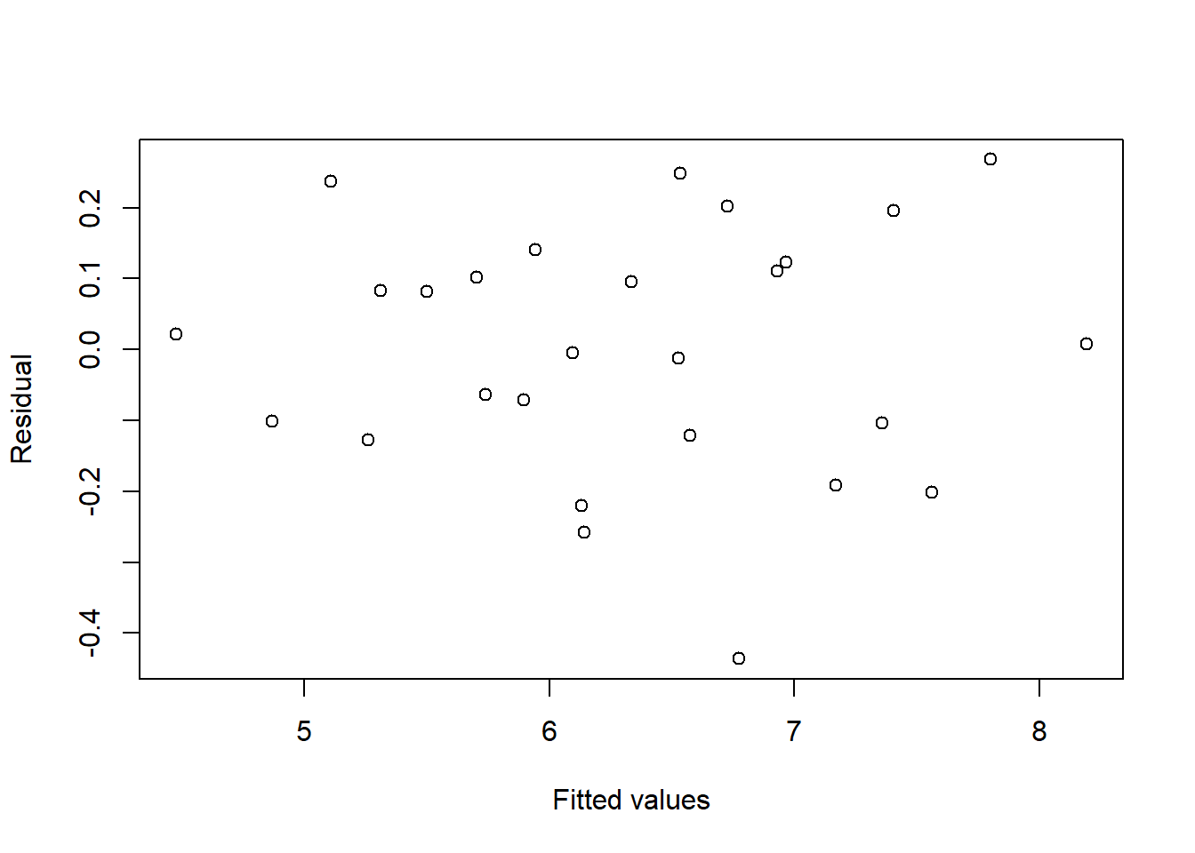
Figure 2.9: Residuals and fitted values for the first order model fitted to the log-transformed response of the Wool data
Adding the one parameter \(\lambda\) has eliminated six second-order terms.
2.3.4 Maximum likelihood discussion
The real advantage of the Box-Cox transformation is that it permits the mathematical equivalent of a slider to find the best value of \(\lambda\). If some measure of goodness of fit can be found, standard calculus methods can be used to find the value of \(\lambda\) which optimises it.
Usually we have used the residual sum of squares as a measure of goodness of fit. For a given value of \(\lambda\) minimising the residual sum of squares of \(y^*(\lambda)\) provides estimates of the parameters, but between different \(\lambda\) values allowance has to be made for the effect of \(\lambda\) on the scale of the observations.
Consideration of the residual sum of squares for the models above, shows us that RSS diminishes as \(\lambda\) changes from 1 (raw data) to 0 (log transform); this is because the scale of the response being used is changing. This change of response variable means we cannot use RSS to indicate the better fitting model.
We say that the The Box-Cox transformation is not scale invariant, so something other than RSS must be used to estimate \(\lambda\) when we use this form of the transformation.
In inference courses you learn how maximising the likelihood gives a general method for estimating parameters. Firstly, likelihood requires an assumption about the distribution of Y. In our example this means assuming that \(Y^*\) is normally distributed. The basic idea of likelihood is that observing a single value \(Y_i^*\) supports an estimate of \(\mu_Y\) near to \(y_i^*\), because that is where the density curve has its maximum. When the observation is a random sample \(y^*\) the estimate is chosen to maximise the joint density of \(Y^*\).
Linear regression is a familiar case. If \(\lambda\) is assumed known, and \(y_i^*(\lambda)\) is assumed to be a normally distributed random variable with mean \(\alpha + \beta x_i\) the joint density of \(y^*\) is \[f(y^*) = \left(\frac{1}{2\pi\sigma^2}\right)^{n/2} \exp\left( \frac{ -\sum_i {\left(y_i^* - (\hat{\alpha}+\hat{\beta}x_i) \right)^2} }{ 2\sigma^2 }\right)\] This is the product of n normal densities. The likelihood function is therefore \[L(\alpha, \beta,\sigma^2)= \left(\frac{1}{2\pi\sigma^2}\right)^{n/2} \exp\left( \frac{ -\sum_i {\left(y_i^* - (\hat{\alpha}+\hat{\beta}x_i) \right)^2} }{ 2\sigma^2 }\right)\]
For a given \(\sigma^2\) this is maximised by choosing \(\alpha\) and \(\beta\) to minimise the residual sum of squares in the exponent, so least squares is the same as maximum likelihood for normally distributed data. Then choosing \(\sigma^2\) to be this sum of squares divided by n gives the maximum value of L over \(\sigma\), \(\alpha\) and \(\beta\). This result follows from straightforward calculus maximisation.
Of course, \(\lambda\) is not yet known, so it must be estimated. It too can be found by calculus maximization, but the equations are not so straight forward. It can be shown, however, that the simple addition of a scale parameter to the Box-Cox transformation makes it scale invariant, so that minimising the residual sum of squares after this new transformation provides the maximum likelihood estimator of \(\lambda\). This revised Box-Cox transformation, \(z(\lambda)\), is defined as \[\begin{equation} \tag{2.11} \begin{array}{rlcr}z(\lambda)&= \dfrac{y^ \lambda -1}{\lambda \dot{y}^{\lambda-1}} &\quad&\lambda\ne 0\\ &=\dot{y}\ln y && \lambda=0\end{array} \end{equation}\] where \(\dot{y}\) is the geometric mean of the observations. The geometric mean of a sample of size n is the nth root of their product, so \[n \ln \dot{y}= \sum \ln y_i\] As far as the observations are concerned this is the same as the Box-Cox transformation. The additional constant, \(\dot{y}\) has the effect of scaling the transformation so that the scale of \(z(\lambda)\) is y. The units of \(y^\lambda\) in the top line cancel with the units of \(\dot{y}^{\lambda -1}\) in the bottom line so that the units of z are the same as the units of y whatever the value of \(\lambda\). This scale invariance is such a useful extra property that statistical analysis programs ought to use it routinely; unfortunately, they do not. For a given value of \(\lambda\), \(z(\lambda)\) differs from \(y^*\) only in the multiplicative constant, so the maximum likelihood estimates of \(\alpha\) and \(\beta\) are the usual ones found by least squares.
Note that there is still not a formula for \(\lambda\). We still have to try values of \(\lambda\) and find the one which minimises the residual sum of squares. Although many computer package programs exist which maximise functions there are advantages in calculating the residual sum of squares for a range of values of \(\lambda\) , (-2 to 2 will usually suffice) and plotting the curve. A sharply pointed curve indicates the likelihood depends strongly on \(\lambda\) , so that \(\lambda\)’s value is estimated quite precisely. However if the curve is flat the likelihood is not strongly dependent on \(\lambda\), meaning that \(\lambda\)’s value is estimated imprecisely. The curve therefore provides more information than a single maximum value.
Figure 2.10 shows this curve plotted for the wool data. Zero appears to be a very plausible value for \(\lambda\) , but if second-order terms are included in the model, it could lie within quite a wide range.
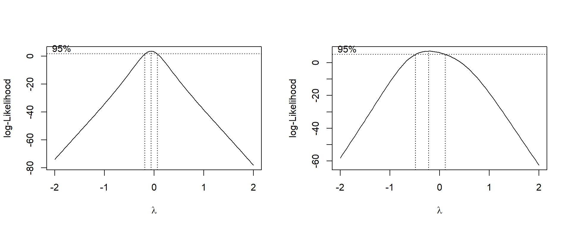
Figure 2.10: Box-Cox transform evaluation for first and second order models for the Wool data
The likelihood function has one further very useful property. We define:
\(L_{\max}(\hat{\lambda})\) to be the maximum value of L over all \(\lambda\) (and \(\beta\)) which is also equal to L evaluated at the maximum likelihood estimate of \(\lambda\) (and \(\beta\)).
\(L_{\max}(\lambda_0)\) is the value of L maximised over \(\beta\) with \(\lambda_0\) fixed at a value specified by \(H_0\).
Then the statistic \(2\left(\log L_{\max}(\hat{\lambda}) - \log L_{\max}(\lambda_0)\right)\) has asymptotically a chi square distribution with one degree of freedom. A plot of the log likelihood against \(\lambda\) not only locates \(\hat{\lambda}\), but also gives an approximate confidence interval for \(\lambda\). A \(100(1-\alpha)\)% interval is those values of \(\lambda\) for which \[\begin{equation} \tag{2.12} 2[\ln L_{\max}(\hat{\lambda}) - \ln L_{\max}(\lambda_0)] \leq \chi_{1,\alpha}^2 \end{equation}\]
A 95% interval is therefore all values for which this difference is less than \(\chi_{1,0.05}^2\), which is 3.8415 (to four decimal places).
For the wool data with a first order model L is at a maximum when \(\hat{\lambda}= -0.0593\), and the approximate confidence interval is -0.183 to 0.064, including \(\lambda=0\) (or \(y^*= \ln y\)) and firmly excluding \(\lambda=1\) (or \(y^* = y\)). These figures are read off the graph in Figure 2.10, not found analytically.
For any fixed value of \(\lambda\) the second order model will have higher likelihood than the first order model because it contains six extra parameters. To be significant the difference would have to be greater than \(\chi_{6,0.05}^2\) or 12.6. Figure 2.10 is sufficient to show that the difference is nothing like this large. The curve for the second order model is much flatter than for the first order model. This shows that the second order terms are acting as an alternative (to some extent) to the value of \(\lambda\). As \(\lambda\) changes, the second order terms change to compensate so that the overall fit remains almost as good.
We can now conclude that a log transformation with a first order model would be the best choice for this data.
2.4 Given the Variance, Find the Transformation
A common situation is that a residual plot or a sampling model suggests that the variance is a function of the mean, \(\mu_Y\) — that is: \(var(Y) = g(\mu_y)\). Sometimes the distribution of Y implies a function g; for example if Y has Poisson distribution, var\((Y) = \mu\). Is it possible to find a transformation f so that var\(\left[f(Y)\right]\) is approximately constant?
A little analysis gives a formula for the required transformation. The argument runs like this:
A Taylor series for \(f(y)\) gives \[\begin{equation} \tag{2.13} f(y)= f(\mu) + (y-\mu)f^\prime(\mu) + \frac{1}{2} (y-\mu)^2f^{\prime\prime}(\mu) + \ldots \end{equation}\] Ignoring \((y - \mu)^2\) and higher terms gives \[\begin{equation} \tag{2.14} f(y) \approx f(\mu) + (y - \mu)f^\prime(\mu) \end{equation}\] so that \[ var[f(Y)] \approx 0 + [f^\prime(\mu)]^2 var(Y)\] The left hand side is what we would like to be constant, \(k^2\) say, and var\((Y)\approx g(\mu)\). Substituting gives
\[\begin{equation} \begin{aligned} k^2&=& [f^\prime(\mu)]^2 g(\mu) \nonumber \\ f^\prime(\mu) &=& \frac{k}{ \sqrt{g(\mu)}} \nonumber \\ f(\mu)&=& \int{\frac{k}{ \sqrt{g(\mu)}} d\mu}\end{aligned} \tag{2.15} \end{equation}\] which is a formula for f , the sought-after transformation.
2.4.1 Example: Mortality of beetles
481 unfortunate beetles were subjected to a range of doses of carbon disulphide gas. The data are given in Table 2.2.
| Dose | NoBeetles | NoKilled |
|---|---|---|
| 1.691 | 59 | 6 |
| 1.724 | 60 | 13 |
| 1.755 | 62 | 18 |
| 1.784 | 56 | 28 |
| 1.811 | 63 | 52 |
| 1.837 | 59 | 53 |
| 1.861 | 62 | 61 |
| 1.884 | 60 | 60 |
Experiments of this nature require the rather dubious assumption that each beetle was killed independently and that the distribution of number killed therefore has a binomial distribution.
If \(y_i\) = proportion killed with dose \(x_i\), this assumption implies that \[var(y_i)= \frac{p_i(1-p_i)}{n_i}\] which is not constant. Equation (2.15) gives the appropriate transformation. \[\begin{aligned} f(p)&=&\int{\frac{k\sqrt{n}}{\sqrt{p(1-p)}} dp} \nonumber \\ &\propto& \sin^{-1}\sqrt{p}\end{aligned}\]
So if Y, the proportion killed, is transformed using \[\begin{equation} \tag{2.16} Y^* = \sin^{-1}\sqrt{Y} \end{equation}\] the variance of \(Y^*\) should be roughly constant. This is the traditional transformation to use for binomial data. As an aside, books from the pre-computer days contained tables of the angular transformation which converted percentages p to degrees, \(\sin^{-1}\).
Figure 2.11 shows plots of the residuals against the fitted values for the models on the untransformed and transformed data.
    Beetles <- Beetles |> mutate(Prop = NoKilled / NoBeetles, TProp= asin(sqrt(Prop)))
    ModelU=lm(Prop~Dose, data=Beetles)
    FitsU=fitted(ModelU)
    ModelT=lm(TProp~Dose, data=Beetles)
FitsT=(sin(fitted(ModelT)))^2par(mfrow=c(1,2))
plot(resid(ModelU)~FitsU, ylab="Residuals", xlab="Fitted values")
plot(resid(ModelT)~FitsT, ylab="Residuals", xlab="Fitted values")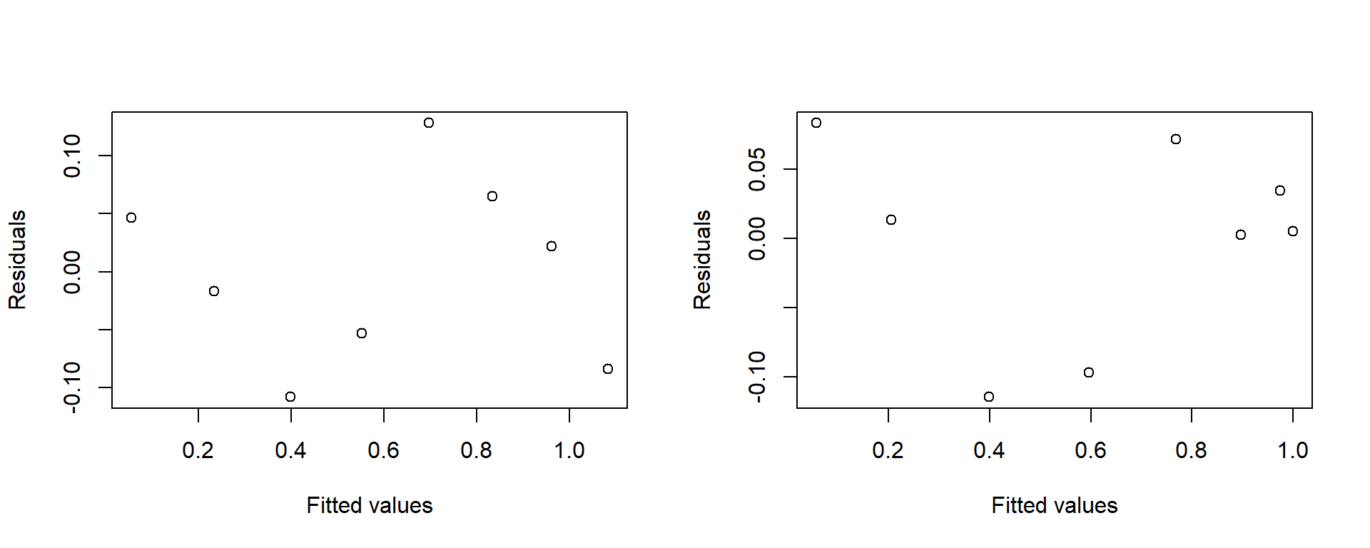
Figure 2.11: Residuals versus fitted values for raw and transformed Beetles data. Fitted values are backtransformed onto the raw scale.
Figure 2.12 shows the models fitted to the untransformed and transformed data, expressed using the raw data scale.
    plot(Prop~Dose, data=Beetles, ylab="Proportion killed")
    abline(ModelU, col=2)
    lines(lowess(FitsT~Beetles$Dose), lty=2)
    legend("bottomright", title="Data used in model was", lty=c(1,2), col=c(2,1),
    legend=c("untransformed", "transformed"))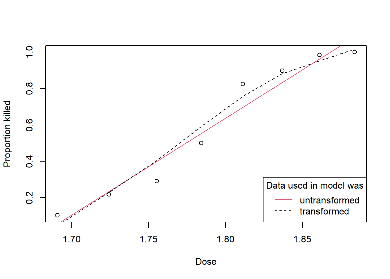
Figure 2.12: Fitted values from raw and transformed response data plotted against the dose applied.
The slight S shape of this curve does fit the data better than a straight line would have, so although the transformation was chosen to make the assumption of constant variance correct, it has also given a better fit.
Finally, we look at the impact the transformation has on the confidence intervals for the mean outcomes. The different gap between the dotted lines in Figure 2.13 shows how the smaller standard deviation of a proportion near \(p=0\) or \(p=1\) is treated under the models using the raw or transformed response.
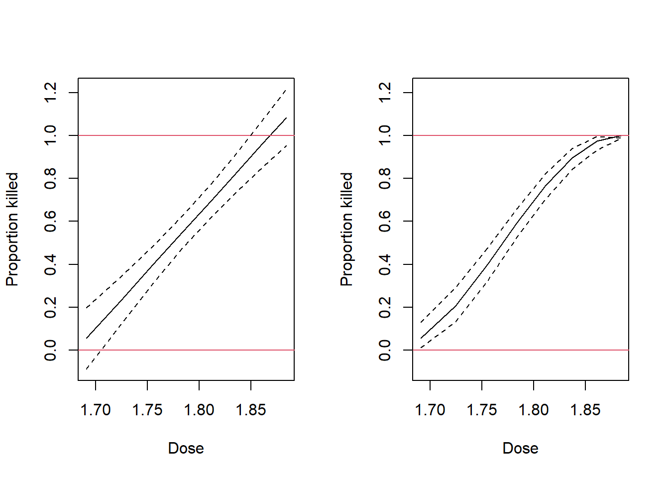
Figure 2.13: Fitted values from the raw and transformed proportions plotted against dose for the Beetles data.
Perhaps the most noticeable feature of these graphs is that the prediction intervals for the untransformed data include values beyond the limits of probability. This problem is not obviated through use of the model based on transformed data, but at least its fitted values are within the bounds of probability. Modelling proportions near zero or one is a challenge, especially when interval estimates are needed. We will see better estimation methods in subsequent chapters. Take particular note of the interval estimate at the right hand side of this graph. It is mathematically correct, but obviously completely wrong to have an interval estimate that does not encompass the actual fitted value!
2.5 Other transformations
The two other common transformations are:
The square root transformation: Used when the variance is proportional to the mean, \(\sigma^2\propto\mu\), common for Poisson or count data for example.
The log transformation: used when the variance is proportional to the square of the mean, \(\sigma^2\propto\mu^2\), or equivalently, the standard deviation is proportional to the mean \(\sigma\propto\mu\), found when the data follow a log-normal distribution for example.
Both of these transformations are encompassed by the Box-Cox family of transformations.
2.6 Summary and Final Thoughts
We started with an example which was treated in a rather ad hoc way, although the transformations had to make biological sense. In the end the choice depended as much on modelling the pattern of variability as on modelling the mean. We next introduced a family of transformations which by scaling a single parameter enabled a range of shapes to be modelled. Because the parameter could be continuously varied, standard computer or mathematical techniques could be used to find the optimum value, where the optimum might maximise a likelihood or perfect the appearance of a residual plot. Finally, if the variance can be expressed as a function of a single parameter related to the mean an approximate variance stabilising transformation can be found.
Note that there are always two assumptions that need to be fulfilled.
The relationship has to be linear.
The variance has to be constant.
Fortuitously the same transformation often achieves both objectives, as it did with the beetle mortality data; this is not always the case. If you’re wondering if the relationship with the mean and the pattern of variability can be modelled independently, read on…
2.7 Exercises
- Determine that the data for 1951 in the Salmon example is in fact an influential observation and that it was correct to have removed it from the presented analysis.
This exercise could be used as an in-class tutorial.
- Table 2.3 comes from the Minitab Handbook (Ryan et al., 1976). It shows measurements of the volume, height and girth of 31 trees.
| Volume | Height | Girth |
|---|---|---|
| 0.29 | 21.3 | 210 |
| 0.29 | 19.8 | 218 |
| 0.28 | 19.2 | 223 |
| 0.46 | 21.9 | 266 |
| 0.53 | 24.6 | 271 |
| 0.55 | 25.2 | 274 |
| 0.44 | 20.1 | 279 |
| 0.63 | 24.3 | 281 |
| 0.56 | 22.8 | 284 |
| 0.68 | 24.0 | 287 |
| 0.59 | 23.1 | 289 |
| 0.60 | 23.1 | 289 |
| 0.60 | 21.0 | 297 |
| 0.54 | 22.8 | 304 |
| 0.62 | 22.5 | 327 |
| 0.95 | 25.9 | 327 |
| 0.77 | 26.2 | 337 |
| 0.72 | 21.6 | 347 |
| 0.70 | 19.5 | 350 |
| 0.97 | 23.7 | 355 |
| 0.89 | 24.3 | 360 |
| 1.02 | 22.5 | 368 |
| 1.08 | 21.9 | 406 |
| 1.08 | 21.9 | 406 |
| 1.20 | 23.4 | 414 |
| 1.56 | 24.6 | 439 |
| 1.57 | 24.9 | 444 |
| 1.65 | 24.3 | 454 |
| 1.45 | 24.3 | 457 |
| 1.44 | 24.3 | 457 |
| 2.18 | 26.5 | 523 |
Explore three models for these data:
Fit y to \(x_1\) and \(x_2\).
Fit \(\ln y\) to \(\ln x_1\) and \(\ln x_2\). Is this model definitely better than the first model?
Fit \(y^*(\lambda)\) to \(x_1\) and \(x_2\). Estimate the value of \(\lambda\) by maximum likelihood. Is this model definitely better than the first model?
Girth is much easier to measure than height. Is there evidence that the height variable is necessary? Finally, which model would be expected to fit best, based on a physical model?
This exercise could be used as an in-class tutorial.
- Re-create the graph for the residual sum of squares resulting from fitting first and second order models based on differing selections of \(\lambda\), as shown in Figure 2.10. Refine the search space for \(\lambda\), and evaluate the benefit of choosing a convenient value for \(\lambda\) as against the optimal value.
This exercise could be used as an in-class tutorial.
- There are many different approaches for finding a transformation. One
major problem with the log transformation is that it cannot handle
response values of zero. A common tweak is to add a small increment to
the zero values in the data; another is to add a constant to all
response values. The
logtrans()function in theMASSpackage will help find a suitable \(\alpha\) for the expression \(\y^\prime=\log(y+\alpha)\) for the transformed response variable. We will investigate the benefits of this transformation using the example for this function.
Confirm that this transformation is sensible under the Box-Cox paradigm. That is, make a transformed response variable (\(y+\alpha\)) using the preferred \(\alpha\) and check that the Box-Cox methodology does suggest the log transformation is appropriate.
The model used in this example is multiplicative. Determine if the transformation suggested is appropriate if an additive model is to be used instead. That is, remove all interactions and check that the selection of \(\alpha\) remains appropriate.