3.4 Using Colors in a Bar Graph
3.4.2 Solution
Map the appropriate variable to the fill aesthetic.
We’ll use the uspopchange data set for this example. It contains the percentage change in population for the US states from 2000 to 2010. We’ll take the top 10 fastest-growing states and graph their percentage change. We’ll also color the bars by region (Northeast, South, North Central, or West).
First, take the top 10 states:
library(gcookbook) # Load gcookbook for the uspopchange data set
library(dplyr)

upc <- uspopchange %>%
  arrange(desc(Change)) %>%
  slice(1:10)

upc
#>             State Abb Region Change
#> 1          Nevada  NV   West   35.1
#> 2         Arizona  AZ   West   24.6
#> 3            Utah  UT   West   23.8
#>  ...<4 more rows>...
#> 8         Florida  FL  South   17.6
#> 9        Colorado  CO   West   16.9
#> 10 South Carolina  SC  South   15.3
Now we can make the graph, mapping Region to fill (Figure 3.9):
ggplot(upc, aes(x = Abb, y = Change, fill = Region)) +
  geom_col()
#> This is an untitled chart with no subtitle or caption.
#> It has x-axis 'Abb' with labels AZ, CO, FL, GA, ID, NC, NV, SC, TX and UT.
#> It has y-axis 'Change' with labels 0, 10, 20 and 30.
#> There is a legend indicating fill is used to show Region, with 2 levels:
#> South shown as strong reddish orange fill and
#> West shown as brilliant bluish green fill.
#> The chart is a bar chart with 10 vertical bars.
#> Bar 1 is centered horizontally at NV, and spans vertically from 0 to 35.1 with fill colour brilliant bluish green which maps to Region = West.
#> Bar 2 is centered horizontally at AZ, and spans vertically from 0 to 24.6 with fill colour brilliant bluish green which maps to Region = West.
#> Bar 3 is centered horizontally at UT, and spans vertically from 0 to 23.8 with fill colour brilliant bluish green which maps to Region = West.
#> Bar 4 is centered horizontally at ID, and spans vertically from 0 to 21.1 with fill colour brilliant bluish green which maps to Region = West.
#> Bar 5 is centered horizontally at TX, and spans vertically from 0 to 20.6 with fill colour strong reddish orange which maps to Region = South.
#> Bar 6 is centered horizontally at NC, and spans vertically from 0 to 18.5 with fill colour strong reddish orange which maps to Region = South.
#> Bar 7 is centered horizontally at GA, and spans vertically from 0 to 18.3 with fill colour strong reddish orange which maps to Region = South.
#> Bar 8 is centered horizontally at FL, and spans vertically from 0 to 17.6 with fill colour strong reddish orange which maps to Region = South.
#> Bar 9 is centered horizontally at CO, and spans vertically from 0 to 16.9 with fill colour brilliant bluish green which maps to Region = West.
#> Bar 10 is centered horizontally at SC, and spans vertically from 0 to 15.3 with fill colour strong reddish orange which maps to Region = South.
#> These are stacked, as sorted by Region.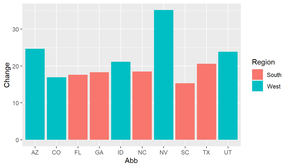
Figure 3.9: A variable mapped to fill
3.4.3 Discussion
The default colors aren’t the most appealing, so you may want to set them using scale_fill_brewer() or scale_fill_manual(). With this example, we’ll use the latter, and we’ll set the outline color of the bars to black, with colour="black" (Figure 3.10). Note that setting occurs outside of aes(), while mapping occurs within aes():
ggplot(upc, aes(x = reorder(Abb, Change), y = Change, fill = Region)) +
  geom_col(colour = "black") +
  scale_fill_manual(values = c("#669933", "#FFCC66")) +
  xlab("State")
#> This is an untitled chart with no subtitle or caption.
#> It has x-axis 'State' with labels SC, CO, FL, GA, NC, TX, ID, UT, AZ and NV.
#> It has y-axis 'Change' with labels 0, 10, 20 and 30.
#> There is a legend indicating fill is used to show Region, with 2 levels:
#> South shown as strong yellow green fill and
#> West shown as brilliant orange yellow fill.
#> The chart is a bar chart with 10 vertical bars.
#> Bar 1 is centered horizontally at NV, and spans vertically from 0 to 35.1 with fill colour brilliant orange yellow which maps to Region = West.
#> Bar 2 is centered horizontally at AZ, and spans vertically from 0 to 24.6 with fill colour brilliant orange yellow which maps to Region = West.
#> Bar 3 is centered horizontally at UT, and spans vertically from 0 to 23.8 with fill colour brilliant orange yellow which maps to Region = West.
#> Bar 4 is centered horizontally at ID, and spans vertically from 0 to 21.1 with fill colour brilliant orange yellow which maps to Region = West.
#> Bar 5 is centered horizontally at TX, and spans vertically from 0 to 20.6 with fill colour strong yellow green which maps to Region = South.
#> Bar 6 is centered horizontally at NC, and spans vertically from 0 to 18.5 with fill colour strong yellow green which maps to Region = South.
#> Bar 7 is centered horizontally at GA, and spans vertically from 0 to 18.3 with fill colour strong yellow green which maps to Region = South.
#> Bar 8 is centered horizontally at FL, and spans vertically from 0 to 17.6 with fill colour strong yellow green which maps to Region = South.
#> Bar 9 is centered horizontally at CO, and spans vertically from 0 to 16.9 with fill colour brilliant orange yellow which maps to Region = West.
#> Bar 10 is centered horizontally at SC, and spans vertically from 0 to 15.3 with fill colour strong yellow green which maps to Region = South.
#> These are stacked, as sorted by Region.
#> It has colour set to black.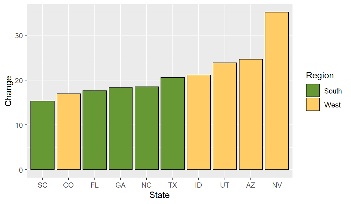
Figure 3.10: Graph with different colors, black outlines, and sorted by percentage change
This example also uses the reorder() function to reorder the levels of the factor Abb based on the values of Change. In this particular case it makes sense to sort the bars by their height, instead of in alphabetical order.