4.2 Adding Points to a Line Graph
4.2.2 Solution
Add geom_point() (Figure 4.4):
ggplot(BOD, aes(x = Time, y = demand)) +
  geom_line() +
  geom_point()
#> This is an untitled chart with no subtitle or caption.
#> It has x-axis 'Time' with labels 2, 4 and 6.
#> It has y-axis 'demand' with labels 10.0, 12.5, 15.0, 17.5 and 20.0.
#> It has 2 layers.
#> Layer 1 is a set of 1 line.
#> Line 1 connects 6 points, at (1, 8.3), (2, 10.3), (3, 19), (4, 16), (5, 15.6) and (7, 19.8).
#> Layer 2 is a set of 6 points.
#> The points are at:
#> (1, 8.3),
#> (2, 10.3),
#> (3, 19),
#> (4, 16),
#> (5, 15.6) and
#> (7, 19.8)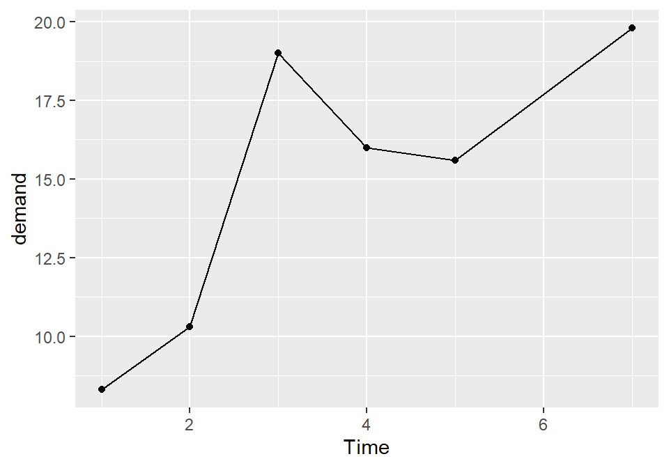
Figure 4.4: Line graph with points
4.2.3 Discussion
Sometimes it is useful to indicate each data point on a line graph. This is helpful when the density of observations is low, or when the observations do not happen at regular intervals. For example, in the BOD data set there is no entry for Time=6, but this is not apparent from just a bare line graph (compare Figure 4.3 with Figure 4.4).
In the worldpop data set, the intervals between each data point are not consistent. In the far past, the estimates were not as frequent as they are in the more recent past. Displaying points on the graph illustrates when each estimate was made (Figure 4.5):
library(gcookbook) # Load gcookbook for the worldpop data set

ggplot(worldpop, aes(x = Year, y = Population)) +
  geom_line() +
  geom_point()
#> This is an untitled chart with no subtitle or caption.
#> It has x-axis 'Year' with labels -10000, -7500, -5000, -2500, 0 and 2500.
#> It has y-axis 'Population' with labels 0e+00, 2e+06, 4e+06 and 6e+06.
#> It has 2 layers.
#> Layer 1 is a set of 1 line.
#> Line 1 connects 58 points.
#> Layer 2 is a set of 58 points.

# Same with a log y-axis
ggplot(worldpop, aes(x = Year, y = Population)) +
  geom_line() +
  geom_point() +
  scale_y_log10()
#> This is an untitled chart with no subtitle or caption.
#> It has x-axis 'Year' with labels -10000, -7500, -5000, -2500, 0 and 2500.
#> It has y-axis 'Population' with labels 1e+04, 1e+05 and 1e+06.
#> It has 2 layers.
#> Layer 1 is a set of 1 line.
#> Line 1 connects 58 points.
#> Layer 2 is a set of 58 points.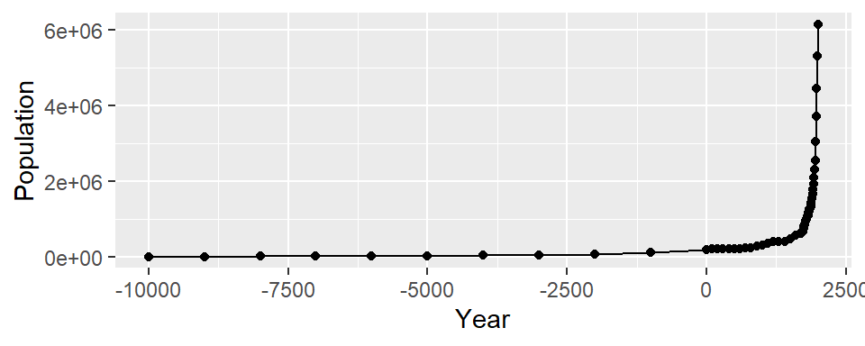
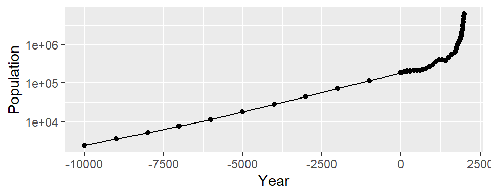
Figure 4.5: Top: points indicate where each data point is; bottom: the same data with a log y-axis
With the log y-axis, you can see that the rate of proportional change has increased in the last thousand years. The estimates for the years before 0 have a roughly constant rate of change of 10 times per 5,000 years. In the most recent 1,000 years, the population has increased at a much faster rate. We can also see that the population estimates are much more frequent in recent times–and probably more accurate!
4.2.4 See Also
To change the appearance of the points, see Recipe 4.5.