3.10 Making a Cleveland Dot Plot
3.10.2 Solution
Cleveland dot plots are an alternative to bar graphs that reduce visual clutter and can be easier to read.
The simplest way to create a dot plot (as shown in Figure 3.28) is to use geom_point():
library(gcookbook) # Load gcookbook for the tophitters2001 data set
tophit <- tophitters2001[1:25, ] # Take the top 25 from the tophitters data set

ggplot(tophit, aes(x = avg, y = name)) +
  geom_point()
#> This is an untitled chart with no subtitle or caption.
#> It has x-axis 'avg' with labels 0.31, 0.32, 0.33, 0.34 and 0.35.
#> It has y-axis 'name' with labels Albert Pujols, Alex Rodriguez, Barry Bonds, Bret Boone, Chipper Jones, Cliff Floyd, Derek Jeter, Frank Catalanotto, Ichiro Suzuki, Jason Giambi, Jeff Cirillo, Jeff Conine, Jose Vidro, Juan Gonzalez, Juan Pierre, Lance Berkman, Larry Walker, Luis Gonzalez, Moises Alou, Paul Lo Duca, Rich Aurilia, Roberto Alomar, Sammy Sosa, Shannon Stewart and Todd Helton.
#> The chart is a set of 25 points.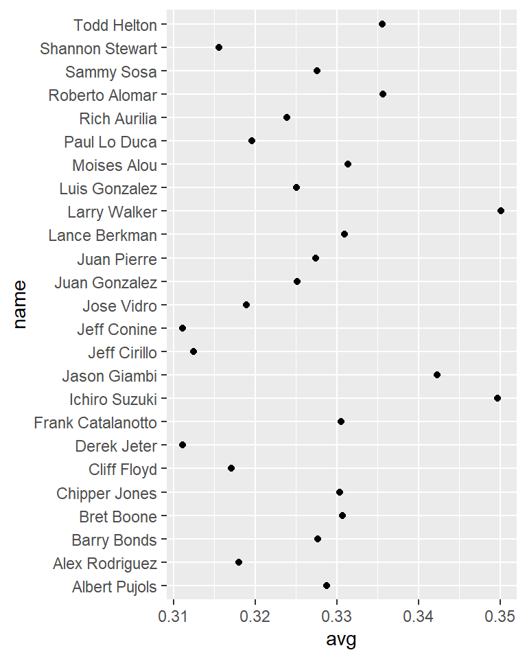
Figure 3.28: Basic dot plot
3.10.3 Discussion
The tophitters2001 data set contains many columns, but we’ll focus on just three of them for this example:
tophit[, c("name", "lg", "avg")]
#>             name lg    avg
#> 1   Larry Walker NL 0.3501
#> 2  Ichiro Suzuki AL 0.3497
#> 3   Jason Giambi AL 0.3423
#>  ...<19 more rows>...
#> 23  Jeff Cirillo NL 0.3125
#> 24   Jeff Conine AL 0.3111
#> 25   Derek Jeter AL 0.3111
In Figure 3.28 the names are sorted alphabetically, which isn’t very useful in this graph. Dot plots are often sorted by the value of the continuous variable on the horizontal axis.
Although the rows of tophit happen to be sorted by avg, that doesn’t mean that the items will be ordered that way in the graph. By default, the items on the given axis will be ordered however is appropriate for the data type. name is a character vector, so it’s ordered alphabetically. If it were a factor, it would use the order defined in the factor levels. In this case, we want name to be sorted by a different variable, avg.
To do this, we can use reorder(name, avg), which takes the name column, turns it into a factor, and sorts the factor levels by avg. To further improve the appearance, we’ll make the vertical grid lines go away by using the theming system, and turn the horizontal grid lines into dashed lines (Figure 3.29):
ggplot(tophit, aes(x = avg, y = reorder(name, avg))) +
  geom_point(size = 3) +  # Use a larger dot
  theme_bw() +
  theme(
    panel.grid.major.x = element_blank(),
    panel.grid.minor.x = element_blank(),
    panel.grid.major.y = element_line(colour = "grey60", linetype = "dashed")
  )
#> This is an untitled chart with no subtitle or caption.
#> It has x-axis 'avg' with labels 0.31, 0.32, 0.33, 0.34 and 0.35.
#> It has y-axis 'reorder(name, avg)' with labels Derek Jeter, Jeff Conine, Jeff Cirillo, Shannon Stewart, Cliff Floyd, Alex Rodriguez, Jose Vidro, Paul Lo Duca, Rich Aurilia, Luis Gonzalez, Juan Gonzalez, Juan Pierre, Sammy Sosa, Barry Bonds, Albert Pujols, Chipper Jones, Frank Catalanotto, Bret Boone, Lance Berkman, Moises Alou, Todd Helton, Roberto Alomar, Jason Giambi, Ichiro Suzuki and Larry Walker.
#> The chart is a set of 25 points.
#> It has size set to 3.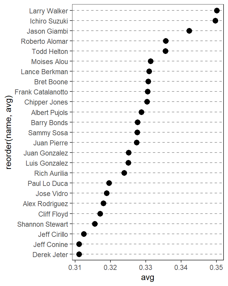
Figure 3.29: Dot plot, ordered by batting average
It’s also possible to swap the axes so that the names go along the x-axis and the values go along the y-axis, as shown in Figure 3.30. We’ll also rotate the text labels by 60 degrees:
ggplot(tophit, aes(x = reorder(name, avg), y = avg)) +
  geom_point(size = 3) +  # Use a larger dot
  theme_bw() +
  theme(
    panel.grid.major.y = element_blank(),
    panel.grid.minor.y = element_blank(),
    panel.grid.major.x = element_line(colour = "grey60", linetype = "dashed"),
    axis.text.x = element_text(angle = 60, hjust = 1)
  )
#> This is an untitled chart with no subtitle or caption.
#> It has x-axis 'reorder(name, avg)' with labels Derek Jeter, Jeff Conine, Jeff Cirillo, Shannon Stewart, Cliff Floyd, Alex Rodriguez, Jose Vidro, Paul Lo Duca, Rich Aurilia, Luis Gonzalez, Juan Gonzalez, Juan Pierre, Sammy Sosa, Barry Bonds, Albert Pujols, Chipper Jones, Frank Catalanotto, Bret Boone, Lance Berkman, Moises Alou, Todd Helton, Roberto Alomar, Jason Giambi, Ichiro Suzuki and Larry Walker.
#> It has y-axis 'avg' with labels 0.31, 0.32, 0.33, 0.34 and 0.35.
#> The chart is a set of 25 points.
#> It has size set to 3.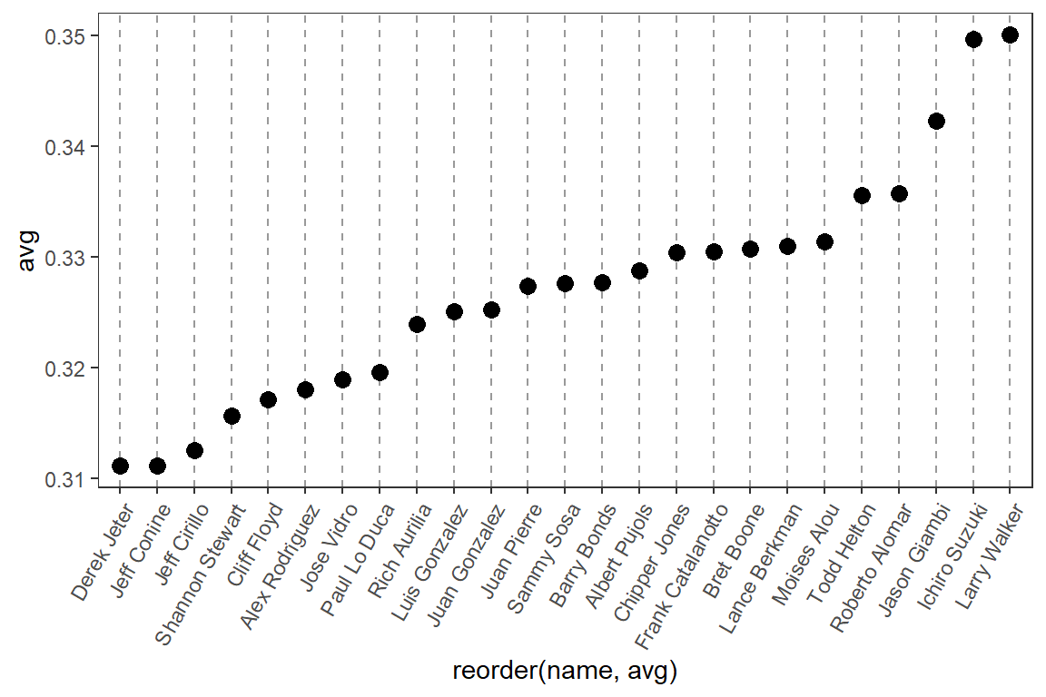
Figure 3.30: Dot plot with names on x-axis and values on y-axis
It’s also sometimes desirable to group the items by another variable. In this case we’ll use the factor lg, which has the levels NL and AL, representing the National League and the American League. This time we want to sort first by lg and then by avg. Unfortunately, the reorder() function will only order factor levels by one other variable; to order the factor levels by two variables, we must do it manually:
# Get the names, sorted first by lg, then by avg
nameorder <- tophit$name[order(tophit$lg, tophit$avg)]

# Turn name into a factor, with levels in the order of nameorder
tophit$name <- factor(tophit$name, levels = nameorder)
To make the graph (Figure 3.31), we’ll also add a mapping of lg to the color of the points. Instead of using grid lines that run all the way across, this time we’ll make the lines go only up to the points, by using geom_segment(). Note that geom_segment() needs values for x, y, xend, and yend:
ggplot(tophit, aes(x = avg, y = name)) +
  geom_segment(aes(yend = name), xend = 0, colour = "grey50") +
  geom_point(size = 3, aes(colour = lg)) +
  scale_colour_brewer(palette = "Set1", limits = c("NL", "AL")) +
  theme_bw() +
  theme(
    panel.grid.major.y = element_blank(),   # No horizontal grid lines
    legend.position = c(1, 0.55),           # Put legend inside plot area
    legend.justification = c(1, 0.5)
  )
#> This is an untitled chart with no subtitle or caption.
#> It has x-axis 'avg' with labels 0.31, 0.32, 0.33, 0.34 and 0.35.
#> It has y-axis 'name' with labels Jeff Conine, Derek Jeter, Shannon Stewart, Alex Rodriguez, Juan Gonzalez, Frank Catalanotto, Bret Boone, Roberto Alomar, Jason Giambi, Ichiro Suzuki, Jeff Cirillo, Cliff Floyd, Jose Vidro, Paul Lo Duca, Rich Aurilia, Luis Gonzalez, Juan Pierre, Sammy Sosa, Barry Bonds, Albert Pujols, Chipper Jones, Lance Berkman, Moises Alou, Todd Helton and Larry Walker.
#> There is a legend indicating colour is used to show lg, with 2 levels:
#> AL shown as strong blue colour and
#> NL shown as vivid red colour.
#> It has 2 layers.
#> Layer 1 is a segment graph that VI can not process.
#> Layer 1 has xend set to 0.
#> Layer 1 has colour set to medium gray.
#> Layer 2 is a set of 25 points.
#> Layer 2 has size set to 3.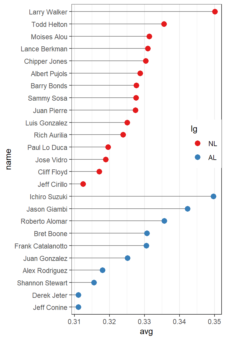
Figure 3.31: Grouped by league, with lines that stop at the point
Another way to separate the two groups is to use facets, as shown in Figure 3.32. The order in which the facets are displayed is different from the sorting order in Figure 3.31; to change the display order, you must change the order of factor levels in the lg variable:
ggplot(tophit, aes(x = avg, y = name)) +
  geom_segment(aes(yend = name), xend = 0, colour = "grey50") +
  geom_point(size = 3, aes(colour = lg)) +
  scale_colour_brewer(palette = "Set1", limits = c("NL", "AL"), guide = FALSE) +
  theme_bw() +
  theme(panel.grid.major.y = element_blank()) +
  facet_grid(lg ~ ., scales = "free_y", space = "free_y")
#> Warning: It is deprecated to specify `guide = FALSE` to remove a guide.
#> Please use `guide = "none"` instead.
#> This is an untitled chart with no subtitle or caption.
#> The chart is comprised of 2 panels containing sub-charts, arranged vertically.
#> The panels represent different values of lg.
#> Each sub-chart has x-axis 'avg'.
#> Each sub-chart has y-axis 'name'.
#> In this chart colour is used to show lg. The legend that would normally indicate this has been hidden.
#> Each sub-chart has 2 layers.
#> Panel 1 represents data for lg = AL.
#> In this panel, x-axis 'avg' has labels 0.31, 0.32, 0.33, 0.34 and 0.35.
#> In this panel, y-axis 'name' has labels Jeff Conine, Derek Jeter, Shannon Stewart, Alex Rodriguez, Juan Gonzalez, Frank Catalanotto, Bret Boone, Roberto Alomar, Jason Giambi and Ichiro Suzuki.
#> Layer 1 of panel 1 is a segment graph that VI can not process.
#> Layer 1 has xend set to 0.
#> Layer 1 has colour set to medium gray.
#> Layer 2 of panel 1 is a set of 10 points.
#> The points are at:
#> (0.35, Ichiro Suzuki) colour strong blue which maps to lg = NL,
#> (0.34, Jason Giambi) colour strong blue which maps to lg = NL,
#> (0.34, Roberto Alomar) colour strong blue which maps to lg = NL,
#> (0.33, Bret Boone) colour strong blue which maps to lg = NL,
#> (0.33, Frank Catalanotto) colour strong blue which maps to lg = NL,
#> (0.33, Juan Gonzalez) colour strong blue which maps to lg = NL,
#> (0.32, Alex Rodriguez) colour strong blue which maps to lg = NL,
#> (0.32, Shannon Stewart) colour strong blue which maps to lg = NL,
#> (0.31, Jeff Conine) colour strong blue which maps to lg = NL and
#> (0.31, Derek Jeter) colour strong blue which maps to lg = NL
#> Layer 2 has size set to 3.
#> Panel 2 represents data for lg = NL.
#> In this panel, x-axis 'avg' has labels 0.31, 0.32, 0.33, 0.34 and 0.35.
#> In this panel, y-axis 'name' has labels Jeff Conine, Derek Jeter, Shannon Stewart, Alex Rodriguez, Juan Gonzalez, Frank Catalanotto, Bret Boone, Roberto Alomar, Jason Giambi and Ichiro Suzuki.
#> Layer 1 of panel 2 is a segment graph that VI can not process.
#> Layer 1 has xend set to 0.
#> Layer 1 has colour set to medium gray.
#> Layer 2 of panel 2 is a set of 15 points.
#> Layer 2 has size set to 3.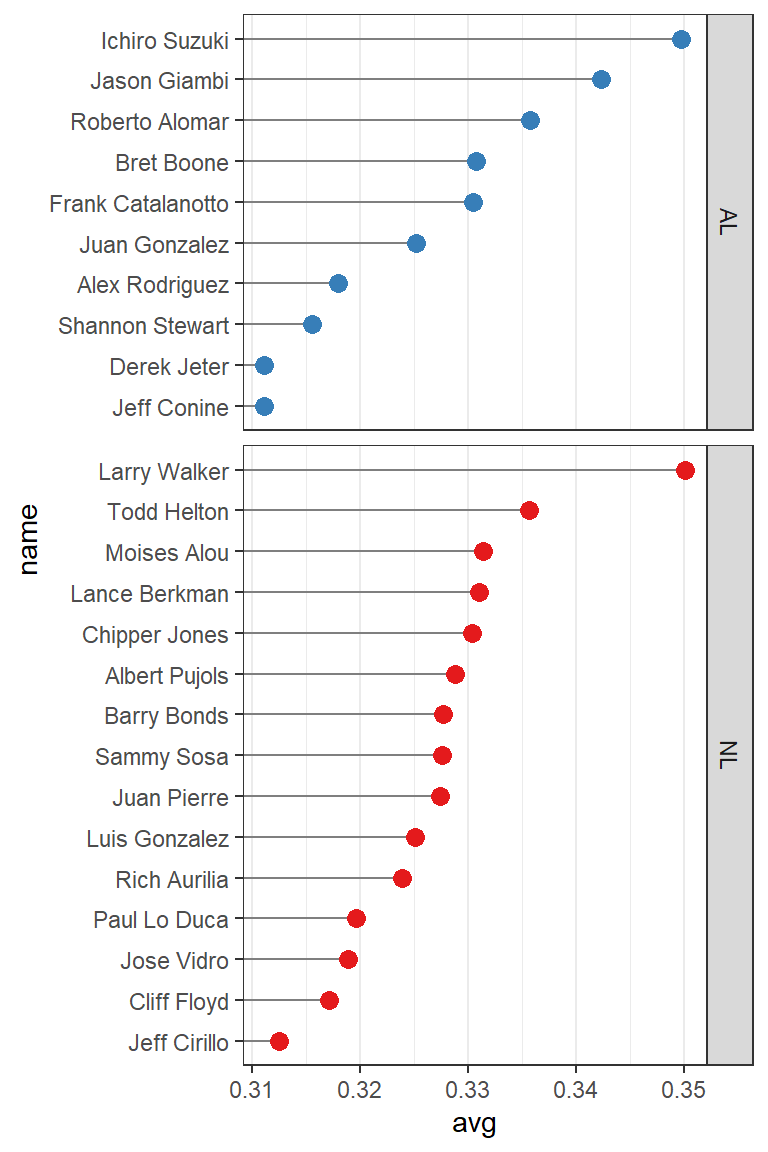
Figure 3.32: Faceted by league