4.3 Making a Line Graph with Multiple Lines
4.3.2 Solution
In addition to the variables mapped to the x- and y-axes, map another (discrete) variable to colour or linetype, as shown in Figure 4.6:
library(gcookbook) # Load gcookbook for the tg data set

# Map supp to colour
ggplot(tg, aes(x = dose, y = length, colour = supp)) +
  geom_line()
#> This is an untitled chart with no subtitle or caption.
#> It has x-axis 'dose' with labels 0.5, 1.0, 1.5 and 2.0.
#> It has y-axis 'length' with labels 10, 15, 20 and 25.
#> There is a legend indicating colour is used to show supp, with 2 levels:
#> OJ shown as strong reddish orange colour and
#> VC shown as brilliant bluish green colour.
#> The chart is a set of 2 lines.
#> Line 1 connects 3 points, at (0.5, 13.23), (1, 22.7) and (2, 26.06).
#> This line has colour strong reddish orange which maps to supp = OJ.
#> Line 2 connects 3 points, at (0.5, 7.98), (1, 16.77) and (2, 26.14).
#> This line has colour brilliant bluish green which maps to supp = VC.

# Map supp to linetype
ggplot(tg, aes(x = dose, y = length, linetype = supp)) +
  geom_line()
#> This is an untitled chart with no subtitle or caption.
#> It has x-axis 'dose' with labels 0.5, 1.0, 1.5 and 2.0.
#> It has y-axis 'length' with labels 10, 15, 20 and 25.
#> There is a legend indicating linetype is used to show supp, with 2 levels:
#> OJ shown as solid linetype and
#> VC shown as 22 linetype.
#> The chart is a set of 2 lines.
#> Line 1 connects 3 points, at (0.5, 13.23), (1, 22.7) and (2, 26.06).
#> This line has line type solid which maps to supp = OJ.
#> Line 2 connects 3 points, at (0.5, 7.98), (1, 16.77) and (2, 26.14).
#> This line has line type 22 which maps to supp = VC.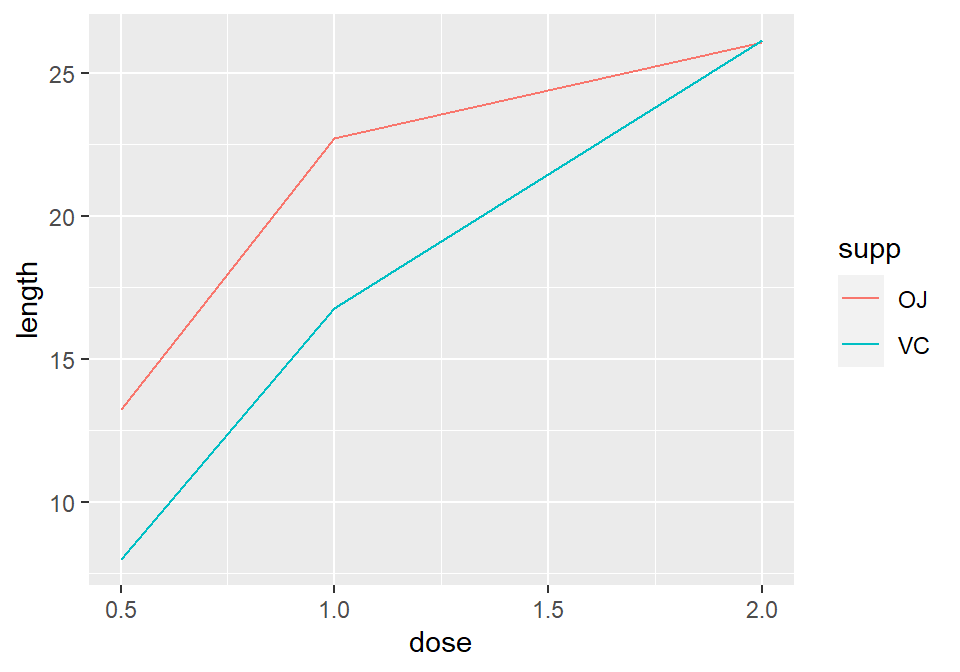
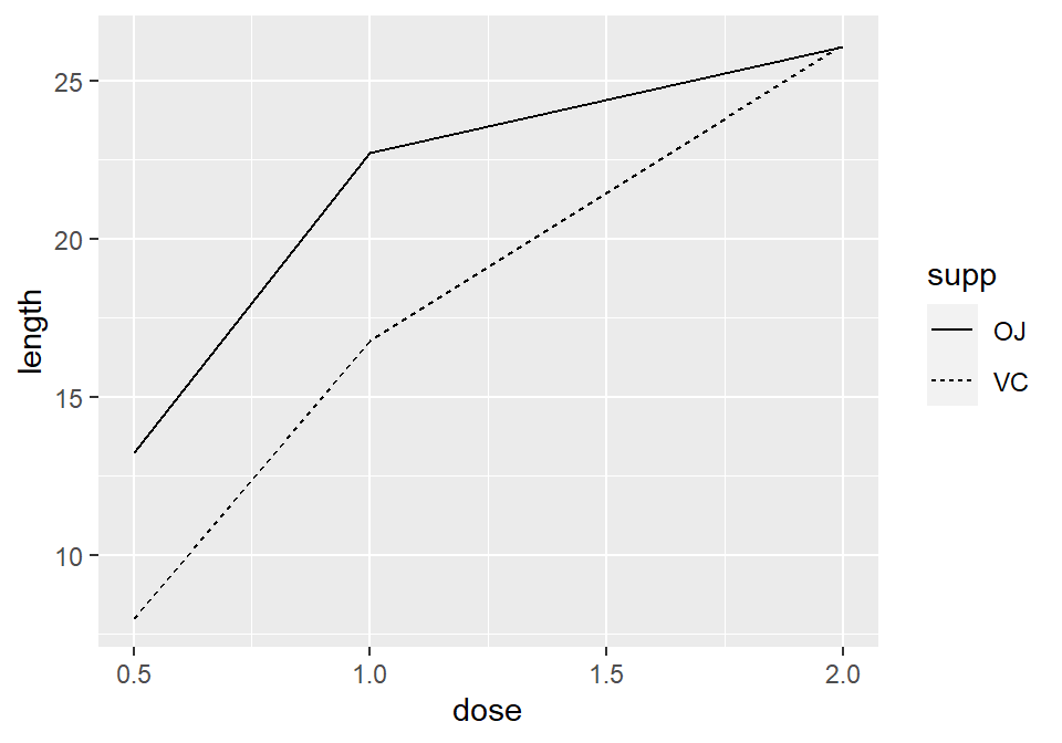
Figure 4.6: A variable mapped to colour (left); A variable mapped to linetype (right)
4.3.3 Discussion
The tg data has three columns, including the factor supp, which we mapped to colour and linetype:
tg
#>   supp dose length
#> 1   OJ  0.5  13.23
#> 2   OJ  1.0  22.70
#> 3   OJ  2.0  26.06
#> 4   VC  0.5   7.98
#> 5   VC  1.0  16.77
#> 6   VC  2.0  26.14
Note
If the x variable is a factor, you must also tell ggplot to group by that same variable, as described below.
Line graphs can be used with a continuous or categorical variable on the x-axis. Sometimes the variable mapped to the x-axis is conceived of as being categorical, even when it’s stored as a number. In the example here, there are three values of dose: 0.5, 1.0, and 2.0. You may want to treat these as categories rather than values on a continuous scale. To do this, convert dose to a factor (Figure 4.7):
ggplot(tg, aes(x = factor(dose), y = length, colour = supp, group = supp)) +
  geom_line()
#> This is an untitled chart with no subtitle or caption.
#> It has x-axis 'factor(dose)' with labels 0.5, 1 and 2.
#> It has y-axis 'length' with labels 10, 15, 20 and 25.
#> There is a legend indicating colour is used to show supp, with 2 levels:
#> OJ shown as strong reddish orange colour and
#> VC shown as brilliant bluish green colour.
#> The chart is a set of 2 lines.
#> Line 1 connects 3 points, at (0.5, 13.23), (1, 22.7) and (2, 26.06).
#> This line has colour strong reddish orange which maps to supp = OJ.
#> Line 2 connects 3 points, at (0.5, 7.98), (1, 16.77) and (2, 26.14).
#> This line has colour brilliant bluish green which maps to supp = VC.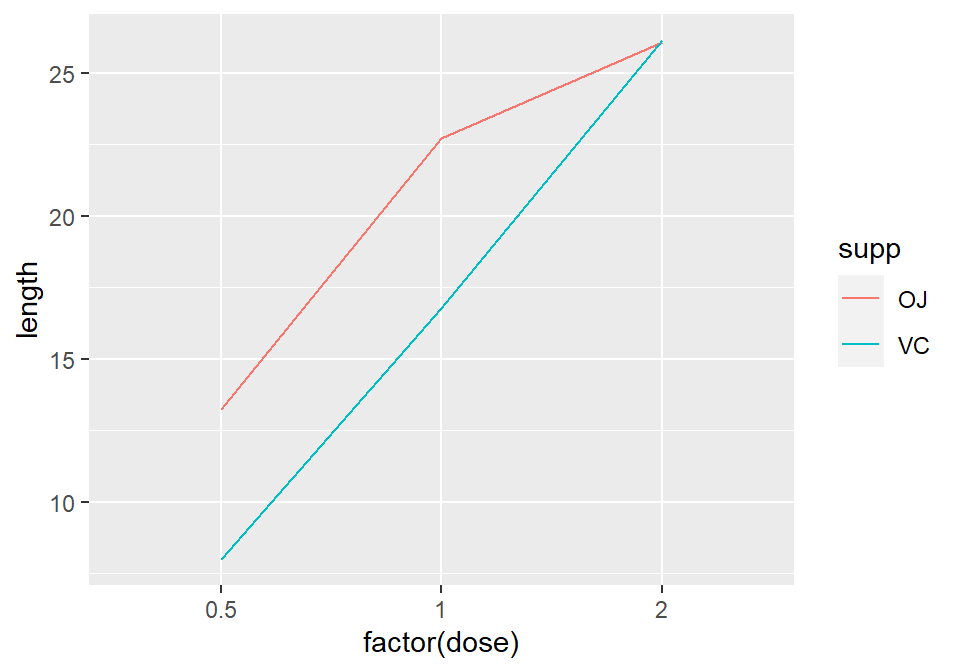
Figure 4.7: Line graph with continuous x variable converted to a factor
Notice the use of group = supp. Without this statement, ggplot won’t know how to group the data together to draw the lines, and it will give an error:
ggplot(tg, aes(x = factor(dose), y = length, colour = supp)) + geom_line()
#> geom_path: Each group consists of only one observation. Do you need to
#> adjust the group aesthetic?
Another common problem when the incorrect grouping is used is that you will see a jagged sawtooth pattern, as in Figure 4.8:
ggplot(tg, aes(x = dose, y = length)) +
  geom_line()
#> This is an untitled chart with no subtitle or caption.
#> It has x-axis 'dose' with labels 0.5, 1.0, 1.5 and 2.0.
#> It has y-axis 'length' with labels 10, 15, 20 and 25.
#> The chart is a set of 1 line.
#> Line 1 connects 6 points, at (0.5, 13.23), (0.5, 7.98), (1, 22.7), (1, 16.77), (2, 26.06) and (2, 26.14).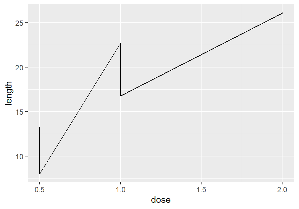
Figure 4.8: A sawtooth pattern indicates improper grouping
This happens because there are multiple data points at each y location, and ggplot thinks they’re all in one group. The data points for each group are connected with a single line, leading to the sawtooth pattern. If any discrete variables are mapped to aesthetics like colour or linetype, they are automatically used as grouping variables. But if you want to use other variables for grouping (that aren’t mapped to an aesthetic), they should be used with group.
Note
When in doubt, if your line graph looks wrong, try explicitly specifying the grouping variable with group. It’s common for problems to occur with line graphs because ggplot is unsure of how the variables should be grouped.
If your plot has points along with the lines, you can also map variables to properties of the points, such as shape and fill (Figure 4.9):
ggplot(tg, aes(x = dose, y = length, shape = supp)) +
  geom_line() +
  geom_point(size = 4)  # Make the points a little larger
#> This is an untitled chart with no subtitle or caption.
#> It has x-axis 'dose' with labels 0.5, 1.0, 1.5 and 2.0.
#> It has y-axis 'length' with labels 10, 15, 20 and 25.
#> There is a legend indicating shape is used to show supp, with 2 levels:
#> OJ shown as solid circle shape and
#> VC shown as solid triangle shape.
#> It has 2 layers.
#> Layer 1 is a set of 2 lines.
#> Line 1 connects 3 points, at (0.5, 13.23), (1, 22.7) and (2, 26.06).
#> Line 2 connects 3 points, at (0.5, 7.98), (1, 16.77) and (2, 26.14).
#> Layer 2 is a set of 6 points.
#> The points are at:
#> (0.5, 13.23) shape solid circle which maps to supp = OJ,
#> (1, 22.7) shape solid circle which maps to supp = OJ,
#> (2, 26.06) shape solid circle which maps to supp = OJ,
#> (0.5, 7.98) shape solid triangle which maps to supp = VC,
#> (1, 16.77) shape solid triangle which maps to supp = VC and
#> (2, 26.14) shape solid triangle which maps to supp = VC
#> Layer 2 has size set to 4.

ggplot(tg, aes(x = dose, y = length, fill = supp)) +
  geom_line() +
  geom_point(size = 4, shape = 21)  # Also use a point with a color fill
#> This is an untitled chart with no subtitle or caption.
#> It has x-axis 'dose' with labels 0.5, 1.0, 1.5 and 2.0.
#> It has y-axis 'length' with labels 10, 15, 20 and 25.
#> There is a legend indicating fill is used to show supp, with 2 levels:
#> OJ shown as strong reddish orange fill and
#> VC shown as brilliant bluish green fill.
#> It has 2 layers.
#> Layer 1 is a set of 2 lines.
#> Line 1 connects 3 points, at (0.5, 13.23), (1, 22.7) and (2, 26.06).
#> Line 2 connects 3 points, at (0.5, 7.98), (1, 16.77) and (2, 26.14).
#> Layer 2 is a set of 6 points.
#> The points are at:
#> (0.5, 13.23) fill strong reddish orange which maps to supp = OJ,
#> (1, 22.7) fill strong reddish orange which maps to supp = OJ,
#> (2, 26.06) fill strong reddish orange which maps to supp = OJ,
#> (0.5, 7.98) fill brilliant bluish green which maps to supp = VC,
#> (1, 16.77) fill brilliant bluish green which maps to supp = VC and
#> (2, 26.14) fill brilliant bluish green which maps to supp = VC
#> Layer 2 has size set to 4.
#> Layer 2 has shape set to fillable circle.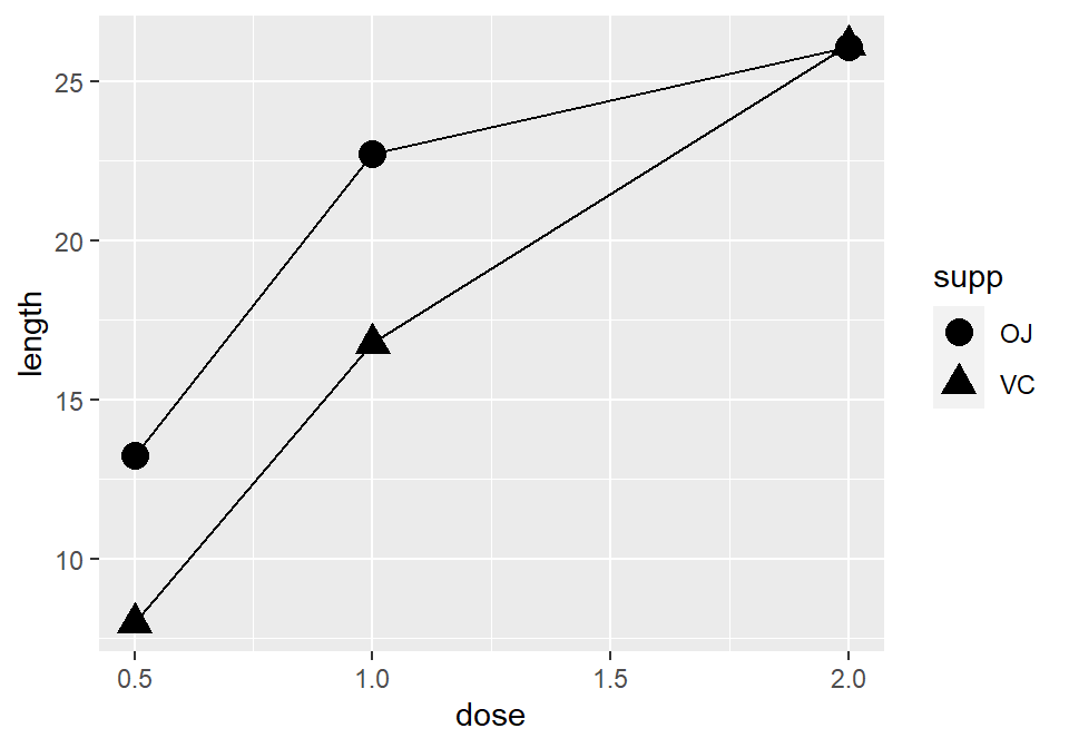
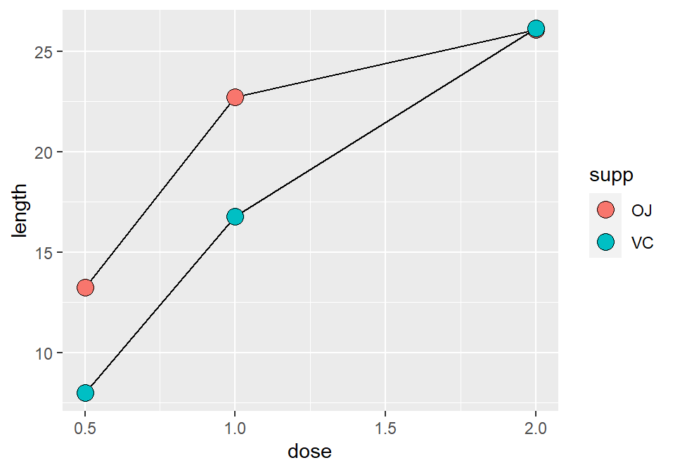
Figure 4.9: Line graph with different shapes (left); With different colors (right)
Sometimes points will overlap. In these cases, you may want to dodge them, which means their positions will be adjusted left and right (Figure 4.10). When doing so, you must also dodge the lines, or else only the points will move and they will be misaligned. You must also specify how far they should move when dodged:
ggplot(tg, aes(x = dose, y = length, shape = supp)) +
  geom_line(position = position_dodge(0.2)) +           # Dodge lines by 0.2
  geom_point(position = position_dodge(0.2), size = 4)  # Dodge points by 0.2
#> This is an untitled chart with no subtitle or caption.
#> It has x-axis 'dose' with labels 0.5, 1.0, 1.5 and 2.0.
#> It has y-axis 'length' with labels 10, 15, 20 and 25.
#> There is a legend indicating shape is used to show supp, with 2 levels:
#> OJ shown as solid circle shape and
#> VC shown as solid triangle shape.
#> It has 2 layers.
#> Layer 1 is a set of 2 lines.
#> Line 1 connects 3 points, at (0.45, 13.23), (0.95, 22.7) and (1.95, 26.06).
#> Line 2 connects 3 points, at (0.55, 7.98), (1.05, 16.77) and (2.05, 26.14).
#> Layer 2 is a set of 6 points.
#> The points are at:
#> (0.45, 13.23) shape solid circle which maps to supp = OJ,
#> (0.95, 22.7) shape solid circle which maps to supp = OJ,
#> (1.95, 26.06) shape solid circle which maps to supp = OJ,
#> (0.55, 7.98) shape solid triangle which maps to supp = VC,
#> (1.05, 16.77) shape solid triangle which maps to supp = VC and
#> (2.05, 26.14) shape solid triangle which maps to supp = VC
#> Layer 2 has size set to 4.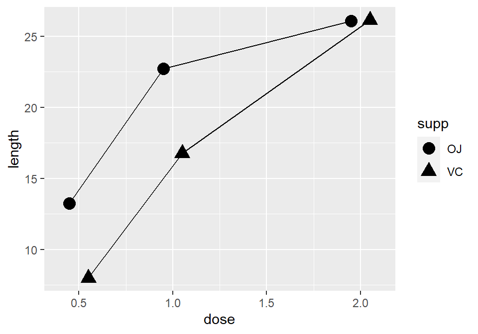
Figure 4.10: Dodging to avoid overlapping points