4.4 Changing the Appearance of Lines
4.4.2 Solution
The type of line (solid, dashed, dotted, etc.) is set with linetype, the thickness (in mm) with size, and the color of the line with colour (or color).
These properties can be set (as shown in Figure 4.11) by passing them values in the call to geom_line():
ggplot(BOD, aes(x = Time, y = demand)) +
  geom_line(linetype = "dashed", size = 1, colour = "blue")
#> This is an untitled chart with no subtitle or caption.
#> It has x-axis 'Time' with labels 2, 4 and 6.
#> It has y-axis 'demand' with labels 10.0, 12.5, 15.0, 17.5 and 20.0.
#> The chart is a set of 1 line.
#> Line 1 connects 6 points, at (1, 8.3), (2, 10.3), (3, 19), (4, 16), (5, 15.6) and (7, 19.8).
#> It has linetype set to dashed.
#> It has size set to 1.
#> It has colour set to vivid violet.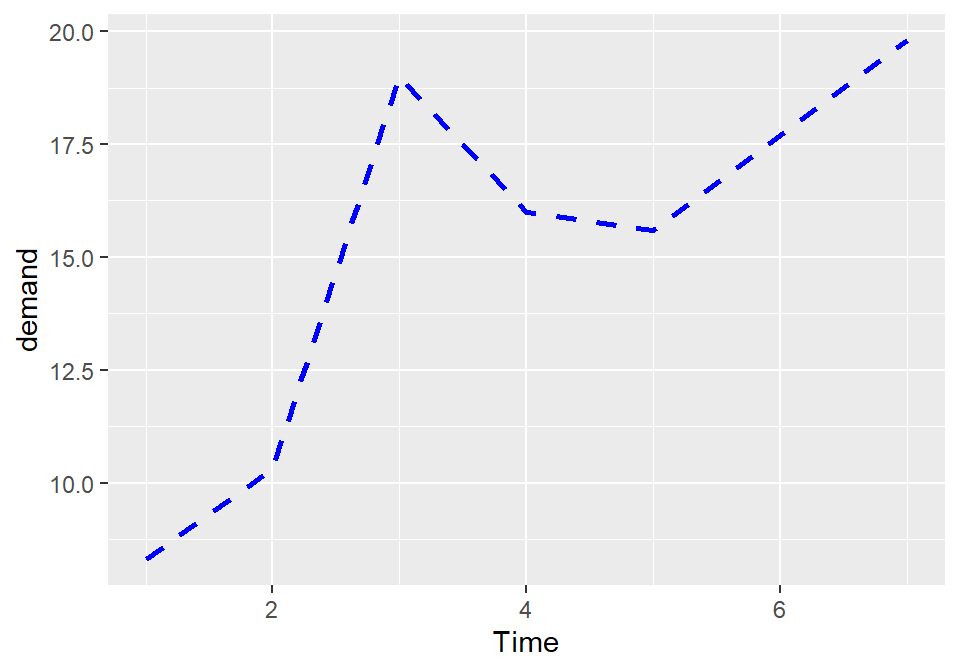
Figure 4.11: Line graph with custom linetype, size, and colour
If there is more than one line, setting the aesthetic properties will affect all of the lines. On the other hand, mapping variables to the properties, as we saw in Recipe 4.3, will result in each line looking different. The default colors aren’t the most appealing, so you may want to use a different palette, as shown in Figure 4.12, by using scale_colour_brewer() or scale_colour_manual():
library(gcookbook)  # Load gcookbook for the tg data set

ggplot(tg, aes(x = dose, y = length, colour = supp)) +
  geom_line() +
  scale_colour_brewer(palette = "Set1")
#> This is an untitled chart with no subtitle or caption.
#> It has x-axis 'dose' with labels 0.5, 1.0, 1.5 and 2.0.
#> It has y-axis 'length' with labels 10, 15, 20 and 25.
#> There is a legend indicating colour is used to show supp, with 2 levels:
#> OJ shown as vivid red colour and
#> VC shown as strong blue colour.
#> The chart is a set of 2 lines.
#> Line 1 connects 3 points, at (0.5, 13.23), (1, 22.7) and (2, 26.06).
#> This line has colour vivid red which maps to supp = OJ.
#> Line 2 connects 3 points, at (0.5, 7.98), (1, 16.77) and (2, 26.14).
#> This line has colour strong blue which maps to supp = VC.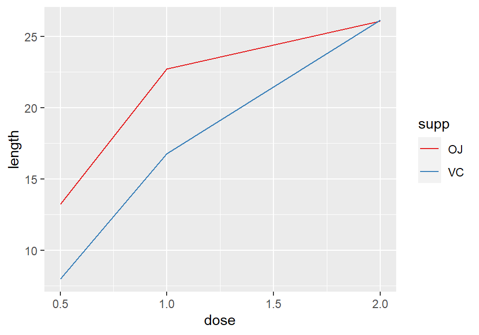
Figure 4.12: Using a palette from RColorBrewer
4.4.3 Discussion
To set a single constant color for all the lines, specify colour outside of aes(). The same works for size, linetype, and point shape (Figure 4.13). You may also have to specify the grouping variable:
# If both lines have the same properties, you need to specify a variable to
# use for grouping
ggplot(tg, aes(x = dose, y = length, group = supp)) +
  geom_line(colour = "darkgreen", size = 1.5)
#> This is an untitled chart with no subtitle or caption.
#> It has x-axis 'dose' with labels 0.5, 1.0, 1.5 and 2.0.
#> It has y-axis 'length' with labels 10, 15, 20 and 25.
#> The chart is a set of 2 lines.
#> Line 1 connects 3 points, at (0.5, 13.23), (1, 22.7) and (2, 26.06).
#> Line 2 connects 3 points, at (0.5, 7.98), (1, 16.77) and (2, 26.14).
#> It has colour set to deep yellowish green.
#> It has size set to 1.5.

# Since supp is mapped to colour, it will automatically be used for grouping
ggplot(tg, aes(x = dose, y = length, colour = supp)) +
  geom_line(linetype = "dashed") +
  geom_point(shape = 22, size = 3, fill = "white")
#> This is an untitled chart with no subtitle or caption.
#> It has x-axis 'dose' with labels 0.5, 1.0, 1.5 and 2.0.
#> It has y-axis 'length' with labels 10, 15, 20 and 25.
#> There is a legend indicating colour is used to show supp, with 2 levels:
#> OJ shown as strong reddish orange colour and
#> VC shown as brilliant bluish green colour.
#> It has 2 layers.
#> Layer 1 is a set of 2 lines.
#> Line 1 connects 3 points, at (0.5, 13.23), (1, 22.7) and (2, 26.06).
#> This line has colour strong reddish orange which maps to supp = OJ.
#> Line 2 connects 3 points, at (0.5, 7.98), (1, 16.77) and (2, 26.14).
#> This line has colour brilliant bluish green which maps to supp = VC.
#> Layer 1 has linetype set to dashed.
#> Layer 2 is a set of 6 points.
#> The points are at:
#> (0.5, 13.23) colour strong reddish orange which maps to supp = OJ,
#> (1, 22.7) colour strong reddish orange which maps to supp = OJ,
#> (2, 26.06) colour strong reddish orange which maps to supp = OJ,
#> (0.5, 7.98) colour brilliant bluish green which maps to supp = VC,
#> (1, 16.77) colour brilliant bluish green which maps to supp = VC and
#> (2, 26.14) colour brilliant bluish green which maps to supp = VC
#> Layer 2 has shape set to fillable square.
#> Layer 2 has size set to 3.
#> Layer 2 has fill set to white.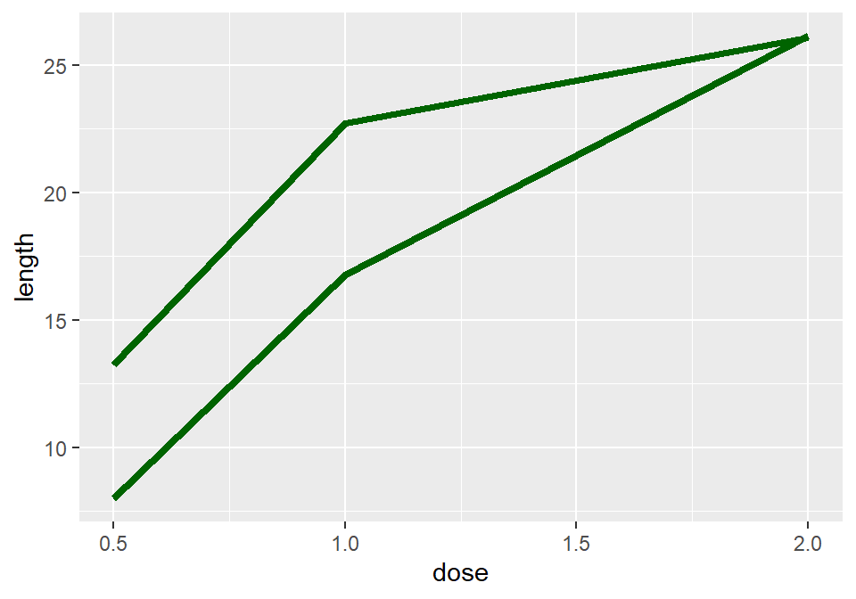
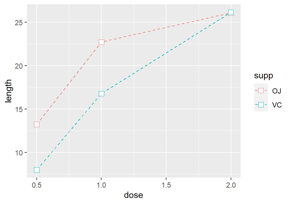
Figure 4.13: Line graph with constant size and color (left); With supp mapped to colour, and with points added (right)
4.4.4 See Also
For more information about using colors, see Chapter ??.