3.3 Making a Bar Graph of Counts
3.3.2 Solution
Use geom_bar() without mapping anything to y (Figure 3.7):
# Equivalent to using geom_bar(stat = "bin")
ggplot(diamonds, aes(x = cut)) +
  geom_bar()
#> This is an untitled chart with no subtitle or caption.
#> It has x-axis 'cut' with labels Fair, Good, Very Good, Premium and Ideal.
#> It has y-axis 'count' with labels 0, 5000, 10000, 15000 and 20000.
#> The chart is a bar chart with 5 vertical bars.
#> Bar 1 is centered horizontally at Fair, and spans vertically from 0 to 1610.
#> Bar 2 is centered horizontally at Good, and spans vertically from 0 to 4906.
#> Bar 3 is centered horizontally at Very Good, and spans vertically from 0 to 12082.
#> Bar 4 is centered horizontally at Premium, and spans vertically from 0 to 13791.
#> Bar 5 is centered horizontally at Ideal, and spans vertically from 0 to 21551.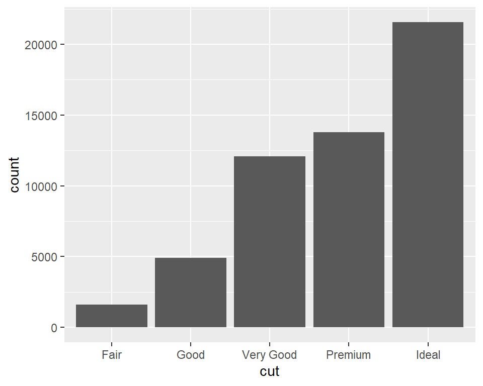
Figure 3.7: Bar graph of counts
3.3.3 Discussion
The diamonds data set has 53,940 rows, each of which represents information about a single diamond:
diamonds
#> # A tibble: 53,940 x 10
#>   carat cut       color clarity depth table price     x     y     z
#>   <dbl> <ord>     <ord> <ord>   <dbl> <dbl> <int> <dbl> <dbl> <dbl>
#> 1  0.23 Ideal     E     SI2      61.5    55   326  3.95  3.98  2.43
#> 2  0.21 Premium   E     SI1      59.8    61   326  3.89  3.84  2.31
#> 3  0.23 Good      E     VS1      56.9    65   327  4.05  4.07  2.31
#> 4  0.29 Premium   I     VS2      62.4    58   334  4.2   4.23  2.63
#> 5  0.31 Good      J     SI2      63.3    58   335  4.34  4.35  2.75
#> 6  0.24 Very Good J     VVS2     62.8    57   336  3.94  3.96  2.48
#> # ... with 53,934 more rows
With geom_bar(), the default behavior is to use stat = "bin", which counts up the number of cases for each group (each x position, in this example). In the graph we can see that there are about 23,000 cases with an ideal cut.
In this example, the variable on the x-axis is discrete. If we use a continuous variable on the x-axis, we’ll get a bar at each unique x value in the data, as shown in Figure 3.8, left:
#> This is an untitled chart with no subtitle or caption.
#> It has x-axis 'carat' with labels 0, 1, 2, 3, 4 and 5.
#> It has y-axis 'count' with labels 0, 1000 and 2000.
#> The chart is a bar chart with 273 vertical bars.
#> This is an untitled chart with no subtitle or caption.
#> It has x-axis 'carat' with labels 0, 1, 2, 3, 4 and 5.
#> It has y-axis 'count' with labels 0, 5000, 10000 and 15000.
#> The chart is a bar chart with 30 vertical bars.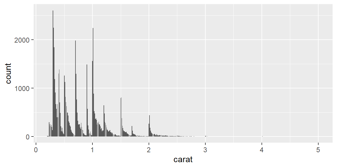
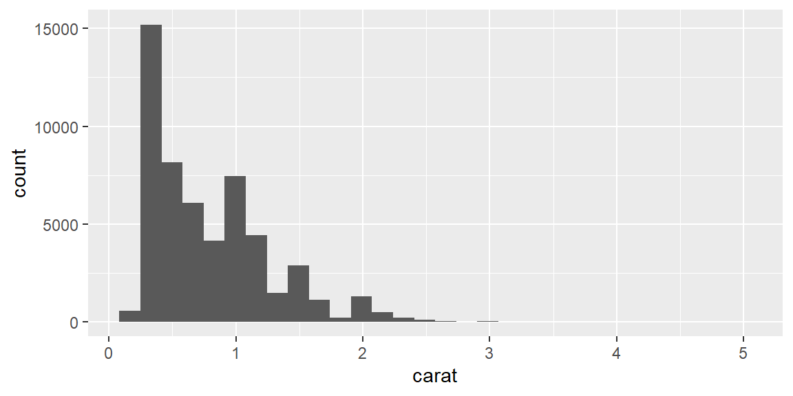
Figure 3.8: Bar graph of counts on a continuous axis (left); A histogram (right)
The bar graph with a continuous x-axis is similar to a histogram, but not the same. A histogram is shown on the right of Figure 3.8. In this kind of bar graph, each bar represents a unique x value, whereas in a histogram, each bar represents a range of x values.
3.3.4 See Also
If, instead of having ggplot() count up the number of rows in each group, you have a column in your data frame representing the y values, use geom_col(). See Recipe 3.1.
You could also get the same graphical output by calculating the counts before sending the data to ggplot(). See Recipe 7.4 for more on summarizing data.
For more about histograms, see Recipe 6.1.