Lecture 18 Piecewise Regression Models
Sometimes we need to specify a different line or curve for different ranges of our predictor variable. Such a model is called piecewise.
18.0.1 the Indianapolis 500 data
This data has the winning speed (an average over 500 miles) for a very famous motor race. This is not a complete series; the race is held in almost every year, with some notable exceptions.
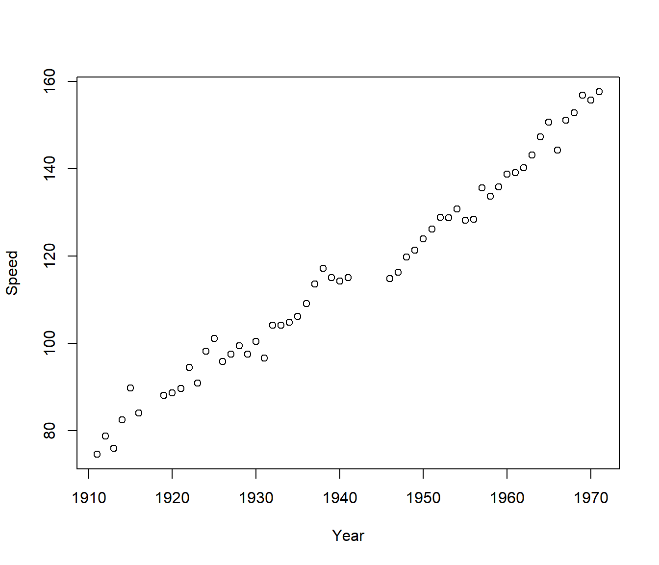
In this example there appear to be three separate line segments, with possibly different slopes before World War I, between the two wars, and after World War II. (The race was not run while the USA was active in the world wars.)
18.1 Allowing for changes in slope
The change points are called *knots, usually we insist that the lines join up at the knots (no discontinuities) but each context will have to be judged on its merits.
A model with a single change in slope at knot \(\kappa\) would have equation \[ y = \beta_0 + \beta_1x + \beta_2 (x-\kappa)_+ + \varepsilon\]
where the term \((x-\kappa)_+\) is defined as: \(x-\kappa\) if \(x>\kappa\); and 0 if \(x \le \kappa\).
This can be calculated in R as ifelse(x<k, 0, x-k) read as if x is less than k, then use zero, else use x-k.
If there are two knots, \(\kappa_1\) and \(\kappa_2\), the same code can be used multiple times.
In the Indianapolis data we have gaps in the years due to the races being cancelled in 1917-18 and 1942-45 due to the USA participating in the wars. We will use the midpoints of the missing years as the knots: \(\kappa_1 = 1917.5\) and \(\kappa_2= 1943.5\). Thus we fit the model
\[ y = \beta_0 + \beta_1 x + \beta_2 (x-\kappa_1)_+ + \beta_3 (x-\kappa_2)_+ + \varepsilon\]
Knot1 = 1917.5
Knot2 = 1943.5
Indy |>
    mutate(t2 = ifelse(Year < Knot1, 0, Year - Knot1), t3 = ifelse(Year < Knot2,
        0, Year - Knot2)) -> Indy

Indy |>
    head() |>
kable()| Speed | Year | t2 | t3 | const2 | const3 |
|---|---|---|---|---|---|
| 74.602 | 1911 | 0 | 0 | 0 | 0 |
| 78.719 | 1912 | 0 | 0 | 0 | 0 |
| 75.933 | 1913 | 0 | 0 | 0 | 0 |
| 82.474 | 1914 | 0 | 0 | 0 | 0 |
| 89.840 | 1915 | 0 | 0 | 0 | 0 |
| 84.001 | 1916 | 0 | 0 | 0 | 0 |
| Speed | Year | t2 | t3 | const2 | const3 | |
|---|---|---|---|---|---|---|
| 50 | 144.317 | 1966 | 48.5 | 22.5 | 1 | 1 |
| 51 | 151.207 | 1967 | 49.5 | 23.5 | 1 | 1 |
| 52 | 152.882 | 1968 | 50.5 | 24.5 | 1 | 1 |
| 53 | 156.867 | 1969 | 51.5 | 25.5 | 1 | 1 |
| 54 | 155.749 | 1970 | 52.5 | 26.5 | 1 | 1 |
| 55 | 157.735 | 1971 | 53.5 | 27.5 | 1 | 1 |
Indy.pce0 <- lm(Speed ~ Year, data = Indy)
Indy.pce1 <- lm(Speed ~ Year + t2 + t3, data = Indy)
summary(Indy.pce1)
Call:
lm(formula = Speed ~ Year + t2 + t3, data = Indy)

Residuals:
    Min      1Q  Median      3Q     Max
-5.6072 -2.0465 -0.3068  1.5065  7.8508

Coefficients:
              Estimate Std. Error t value Pr(>|t|)
(Intercept) -3723.0220   700.5807  -5.314 2.38e-06 ***
Year            1.9878     0.3657   5.435 1.55e-06 ***
t2             -0.9716     0.4070  -2.387 0.020710 *
t3              0.4690     0.1170   4.009 0.000199 ***
---
Signif. codes:  0 '***' 0.001 '**' 0.01 '*' 0.05 '.' 0.1 ' ' 1

Residual standard error: 2.978 on 51 degrees of freedom
Multiple R-squared:  0.9844,    Adjusted R-squared:  0.9835
F-statistic: 1075 on 3 and 51 DF, p-value: < 2.2e-16Analysis of Variance Table
Model 1: Speed ~ Year
Model 2: Speed ~ Year + t2 + t3
Res.Df RSS Df Sum of Sq F Pr(>F)
1 53 595.20
2 51 452.16 2 143.04 8.0668 0.0009038 ***
---
Signif. codes: 0 '***' 0.001 '**' 0.01 '*' 0.05 '.' 0.1 ' ' 1Indy |>
mutate(Fits = fitted.values(Indy.pce1)) |>
ggplot(aes(y = Speed, x = Year)) + geom_point(color = "blue") + geom_point(aes(y = Fits),
color = "red") + labs(y = "Average speed")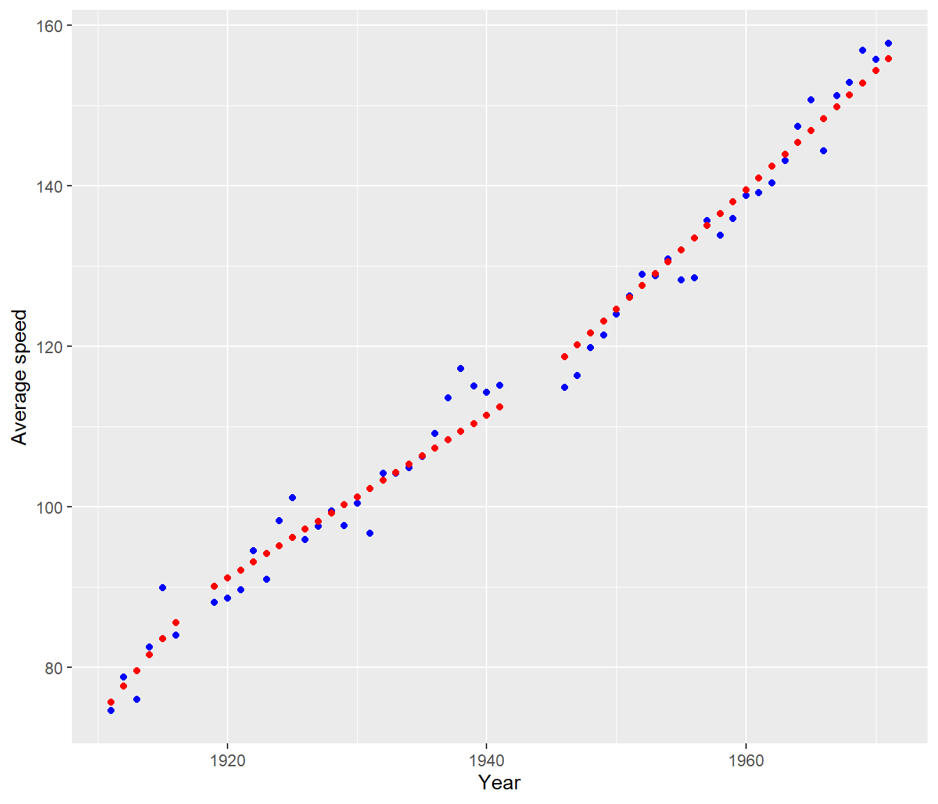
Note that, before WWI, the winning speed was rising by \(\approx 2\) mph per year. The second slope coefficient is \(\approx -1\), which modifies the previous speed. So between the two World Wars the winning speed was rising by \(\approx 1\) mph per year. The third slope coefficient is \(\approx 0.5\) , which means that after WWII the winning speed was rising by \(\approx 1.5\) mph per year.
18.2 Allowing for discontinuity
The preceding analysis indicated a significant change in slope at the two wars. The next question is: Was there a discontinuity? That is, do the line segments have to join up at the knot point? To examine this hypothesis, we must fit a separate intercept for the line in each of the three segments. This can be accomplished by adding the two extra indicator variables, const2 and const3, to the model above to allow the intercepts, in addition to the slopes, to differ between the segments.
Indy |>
    mutate(Const2 = ifelse(Year > Knot1, 1, 0), Const3 = ifelse(Year > Knot2, 1,
        0)) -> Indy

Indy.pce2 <- lm(Speed ~ Year + t2 + t3 + Const2 + Const3, data = Indy)
summary(Indy.pce2)
Call:
lm(formula = Speed ~ Year + t2 + t3 + Const2 + Const3, data = Indy)

Residuals:
    Min      1Q  Median      3Q     Max
-6.4757 -1.5098 -0.1915  1.5079  5.5981

Coefficients:
              Estimate Std. Error t value Pr(>|t|)
(Intercept) -4669.9643  1177.1425  -3.967 0.000237 ***
Year            2.4828     0.6152   4.036 0.000190 ***
t2             -1.2202     0.6205  -1.967 0.054913 .
t3              0.3914     0.1052   3.720 0.000513 ***
Const2         -4.8004     2.9102  -1.650 0.105442
Const3         -7.1176     1.6596  -4.289 8.41e-05 ***
---
Signif. codes:  0 '***' 0.001 '**' 0.01 '*' 0.05 '.' 0.1 ' ' 1

Residual standard error: 2.573 on 49 degrees of freedom
Multiple R-squared:  0.9888,    Adjusted R-squared:  0.9877
F-statistic: 867.5 on 5 and 49 DF, p-value: < 2.2e-16Analysis of Variance Table
Model 1: Speed ~ Year + t2 + t3
Model 2: Speed ~ Year + t2 + t3 + Const2 + Const3
Res.Df RSS Df Sum of Sq F Pr(>F)
1 51 452.16
2 49 324.52 2 127.64 9.6366 0.0002956 ***
---
Signif. codes: 0 '***' 0.001 '**' 0.01 '*' 0.05 '.' 0.1 ' ' 1The anova() indicates that, overall, the model is significantly improved by allowing for discontinuity. The regression coefficients show this is almost entirely due to the change at the second knot, not the first.
The significant coefficient of Const2 says that, if the lines before and after 1943.5 were extended through the period 1941-45, then there would be a drop of 7.1 mph. In practice it looks as if Speed just stopped rising between the wars, rather than actually dropping.
Indy$Fits = fitted.values(Indy.pce2)
Indy |>
    ggplot(aes(y = Speed, x = Year)) + geom_point(color = "blue") + geom_point(aes(y = Fits),
    color = "red") + labs(y = "Average speed")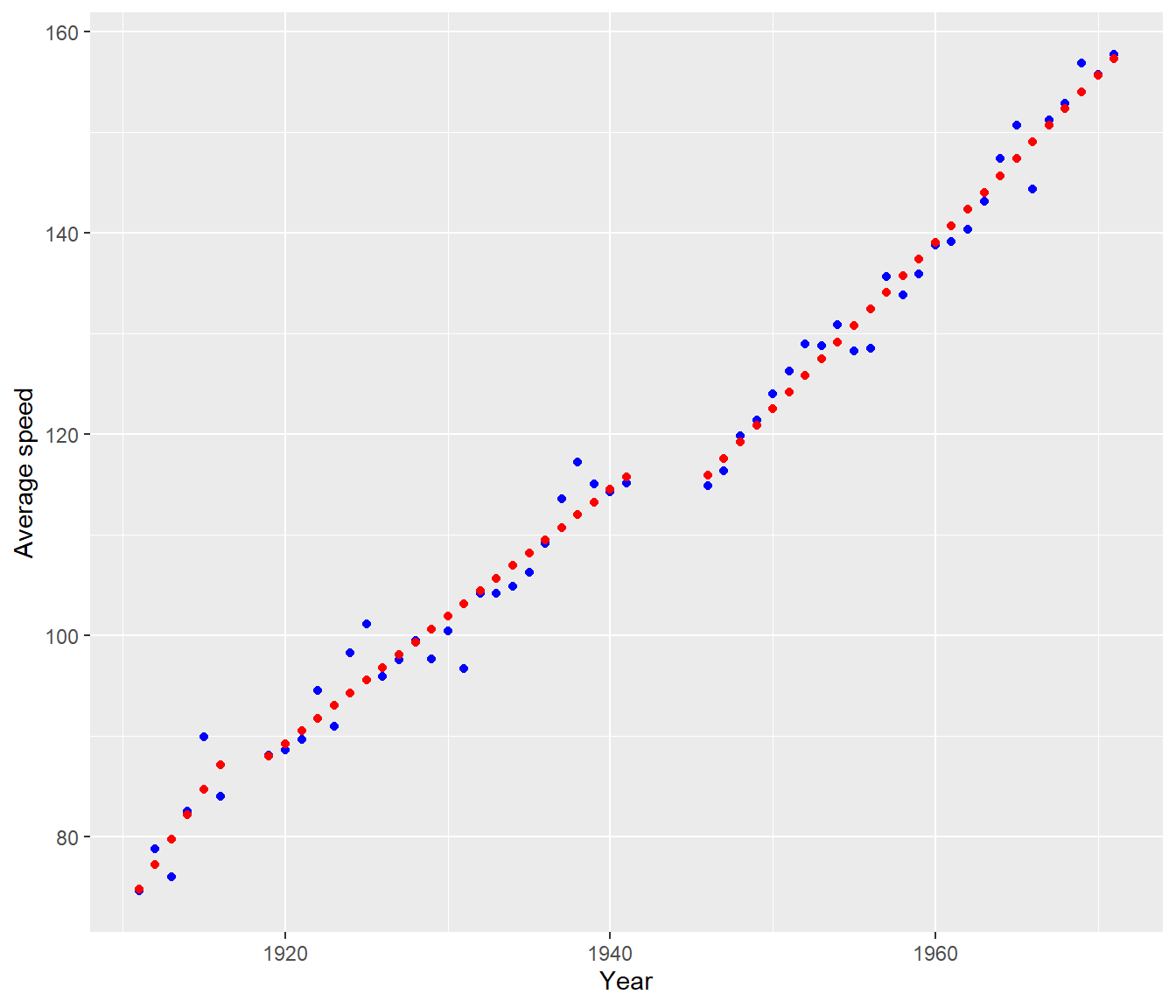
18.3 Extending the piecewise approach
The approach can be extended to allow piecewise quadratic or cubic curves.
Often the curves are constrained so that the sections are not only continuous but smooth i.e. have continuous first derivative at the knots (and of course everywhere else). Such curves are called ‘splines’. Curve fitting by cubic splines is a very old technique. Various splines are available in R, but we will not pursue them any further in this course. In the past splines have frequently been used as a technique for smoothing data, but we can use Lowess curves for that purpose.
It is assumed the knots \(\kappa_1\) and \(\kappa_2\) are known and do not have to be estimated. Sometimes this is reasonable. For example x may represent time and \(\kappa_1\) and \(\kappa_2\) are known events eg. war, stock market crash, etc.
If the position of the knots do have to be estimated then we have a much more complicated statistical problem. This is an area of relatively recent statistical research (e.g. in the last 30 years.) An example where the knot needs to be estimated is where there is some sort of biological tipping point, where the system responds differently to stimuli beyond a certain (unknown) level.
One way of fitting such models is using a nonlinear regression model.
18.4 Example: Child Lung Function Data
FEV (forced expiratory volume) is a measure of lung function. The data include determinations of FEV on 318 female children who were seen in a childhood respiratory disease study in Massachusetts in the U.S. Child’s age (in years) also recorded. It is of interest to model FEV (response) as function of age.
Data source: Tager, I. B., Weiss, S. T., Rosner, B., and Speizer, F. E. (1979). Effect of parental cigarette smoking on pulmonary function in children. American Journal of Epidemiology, 110, 15-26.
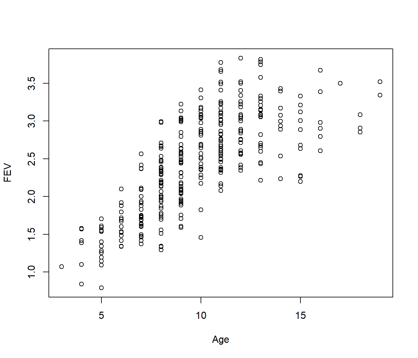
The scatter plot of data indicates that relationship between FEV and age is not linear. We saw how to model FEV as a polynomial in age and decided on the fourth order polynomial model:
If we plot this we find the model seems to have a strange wobble, and steep increasing curves at both ends of the age range.
Fev |>
    mutate(Fits = fitted.values(Fev.lm4)) |>
    ggplot(aes(y = FEV, x = Age)) + geom_point() + geom_point(aes(y = Fits), color = "red")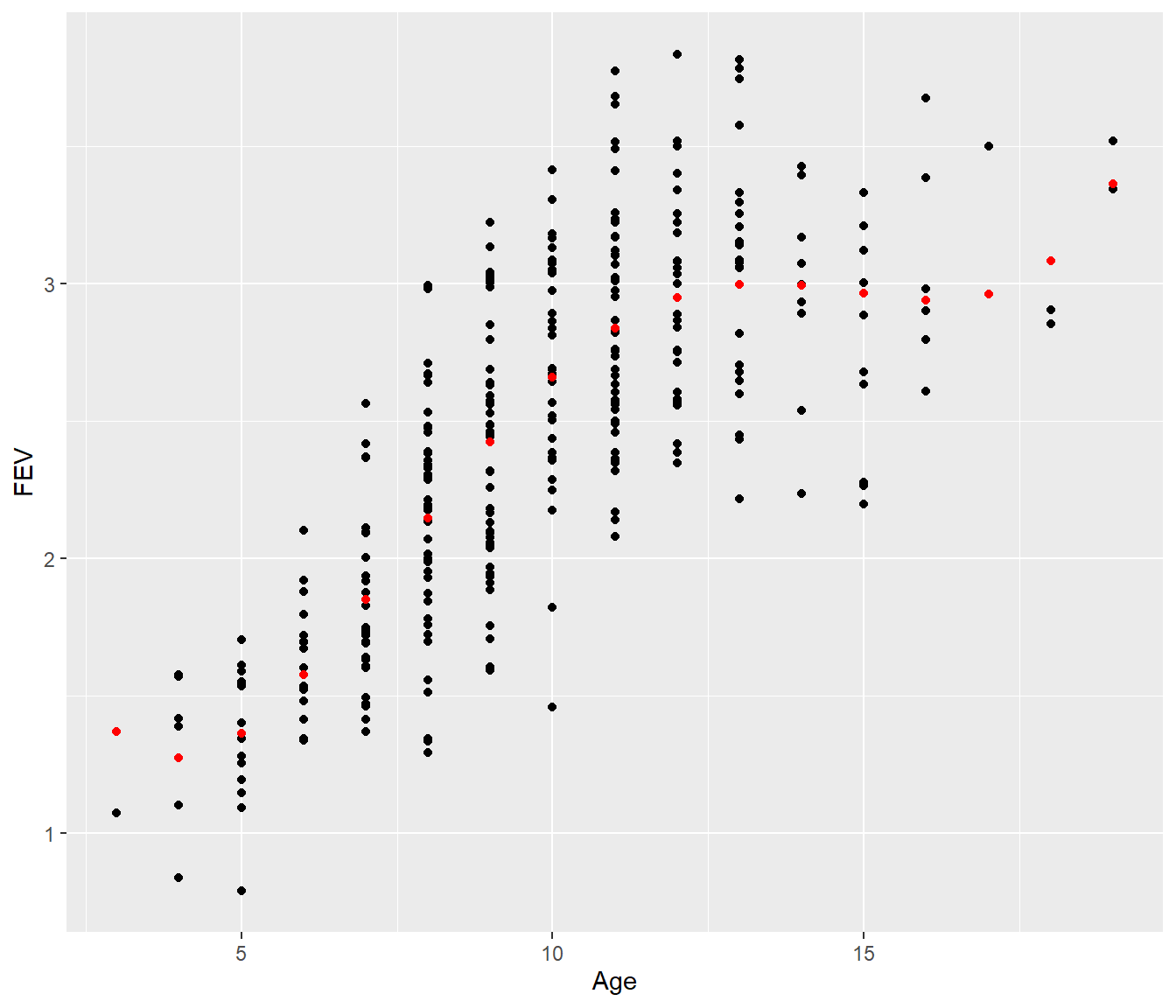
Now suppose instead we fit a piecewise model. Visually it looks like the FEV values flatten out from Age=12 onwards.
k <- 11.5
Fev = Fev |>
    mutate(Age2 = ifelse(Age < k, 0, Age - k))


Fev.pce1 <- lm(FEV ~ Age + Age2, data = Fev)
summary(Fev.pce1)
Call:
lm(formula = FEV ~ Age + Age2, data = Fev)

Residuals:
     Min       1Q   Median       3Q      Max
-1.15825 -0.28309  0.01454  0.24766  0.91692

Coefficients:
            Estimate Std. Error t value Pr(>|t|)
(Intercept)  0.20796    0.10561   1.969   0.0498 *
Age          0.24083    0.01157  20.818   <2e-16 ***
Age2        -0.23117    0.02612  -8.850   <2e-16 ***
---
Signif. codes:  0 '***' 0.001 '**' 0.01 '*' 0.05 '.' 0.1 ' ' 1

Residual standard error: 0.3905 on 315 degrees of freedom
Multiple R-squared:  0.6365,    Adjusted R-squared:  0.6342
F-statistic: 275.8 on 2 and 315 DF,  p-value: < 2.2e-16
Fev |>
mutate(Fits = fitted.values(Fev.pce1)) |>
ggplot(aes(y = FEV, x = Age)) + geom_point() + geom_point(aes(y = Fits), color = "red")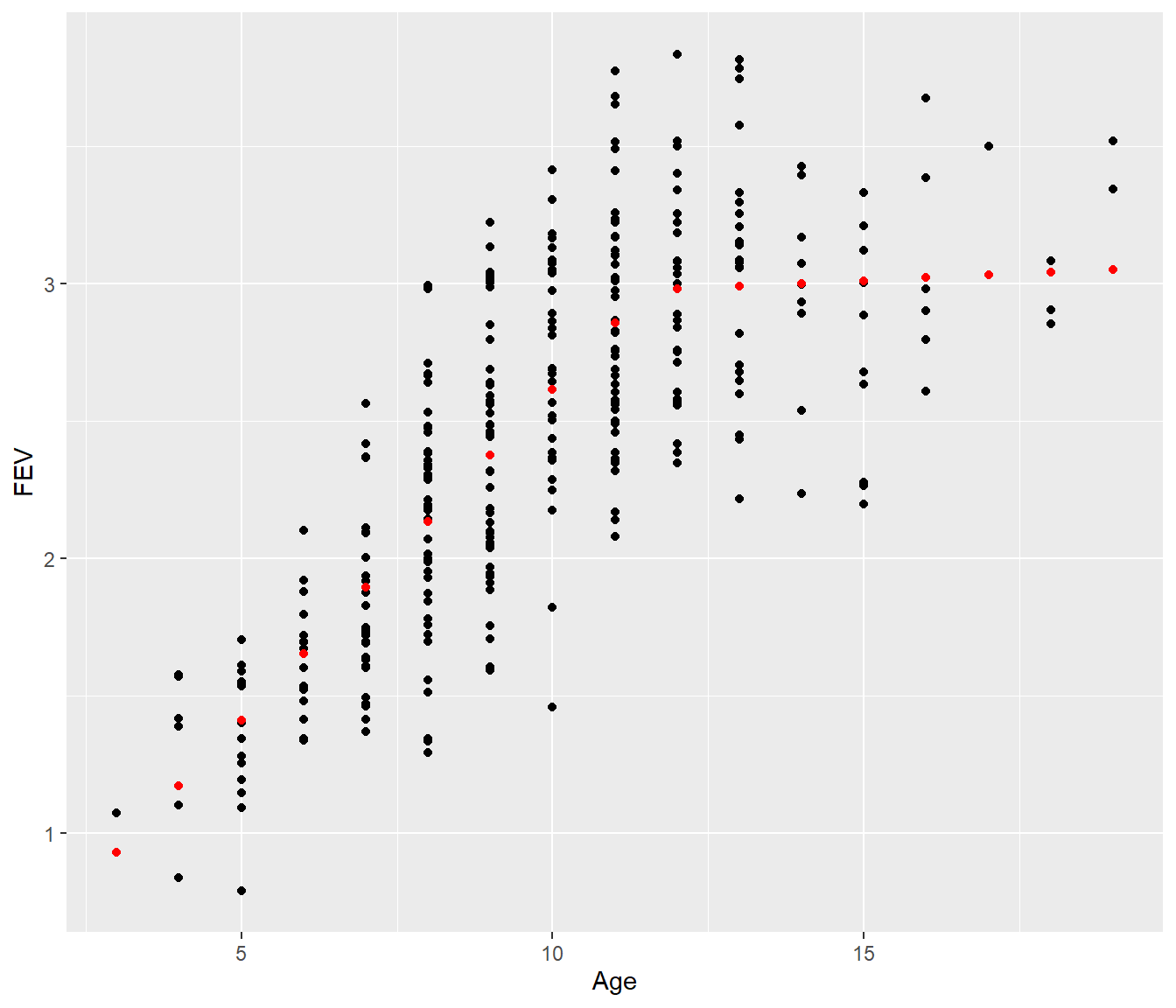
[1] 0.3897186[1] 0.3905442The residual standard error for the simple piecewise model is almost the same as for the more complicated fourth-degree polynomial, and the graph looks more biologically reasonable, so we would probably prefer the piecewise model.
The outcome is that by constructing new variables, we have increased our ability to fit meaningful and more easily interpretable models. We haven’t even allowed for some curvature in the piecewise model, but that will need to be left for extension work.