Lecture 37 Appendix: Transformations in regression models
This (untaught) lecture considers the use of transformations in regression
Students who have taken 161.220 or 161.250 Data Analysis will have seen discussion of transformations, while students who carry on to 161.331 Biostatistics will see a more rigorous discussion of the impact of transforming variables.
37.1 Purpose of transformations
Often the observable relationship between Y and x is not a straight line, but we may be able to transform Y to a new response variable \(Y_{new}\), and/or X to a new response variable \(X_{new}\), in such a way that the relationship between \(Y_{new}\) and \(X_{new}\) is a straight line:
\[ Y_{new} = \beta_0 + \beta_1 X_{new} + \varepsilon_{new}\]
In that case we can do our analysis on the ‘new’ scales, and then back-transform the results.
We still regard the analysis as being in the category of a linear regression, since the \(\beta\)s are separated by pluses, so we can estimate parameters using standard regression methods (linear algebra, etc.).
Sometimes the choice of transformation is suggested by theoretical considerations. But if we don’t have theory to fall back on, then we have to use trial and error, guided by educated guesswork. We rely heavily on finding a model where residuals \(\varepsilon_{new}\) are well-behaved.
Rationale: if there is no pattern or structure left in the residuals then the model for the expected value (line) \(E[Y_{new}|x_{new}]\) must be capturing the gist (main message) of the relationship.
Note it is not enough to use a transformation to make the underlying curve linear. We have to take care of the errors as well. This means conducting a residual analysis, just like any other regression models we fit.
Basically there are three reasons why one would do a transformation
(1) to make the relationship linear (not curved)
(2) to make the errors more normal
(3) to equalise the spread (variance) of residuals
Sometimes a single transformation may fix all three problems. But sometimes we may have to compromise.
Example: Consider the relationship between the density of planting onions and the yield:
Onions = read.csv(file = "../../data/Onions.csv", header = TRUE)
par(mfrow = c(1, 2))
Onions.lm = lm(yield ~ density, data = Onions)
plot(yield ~ density, data = Onions)
plot(residuals(Onions.lm) ~ density, data = Onions)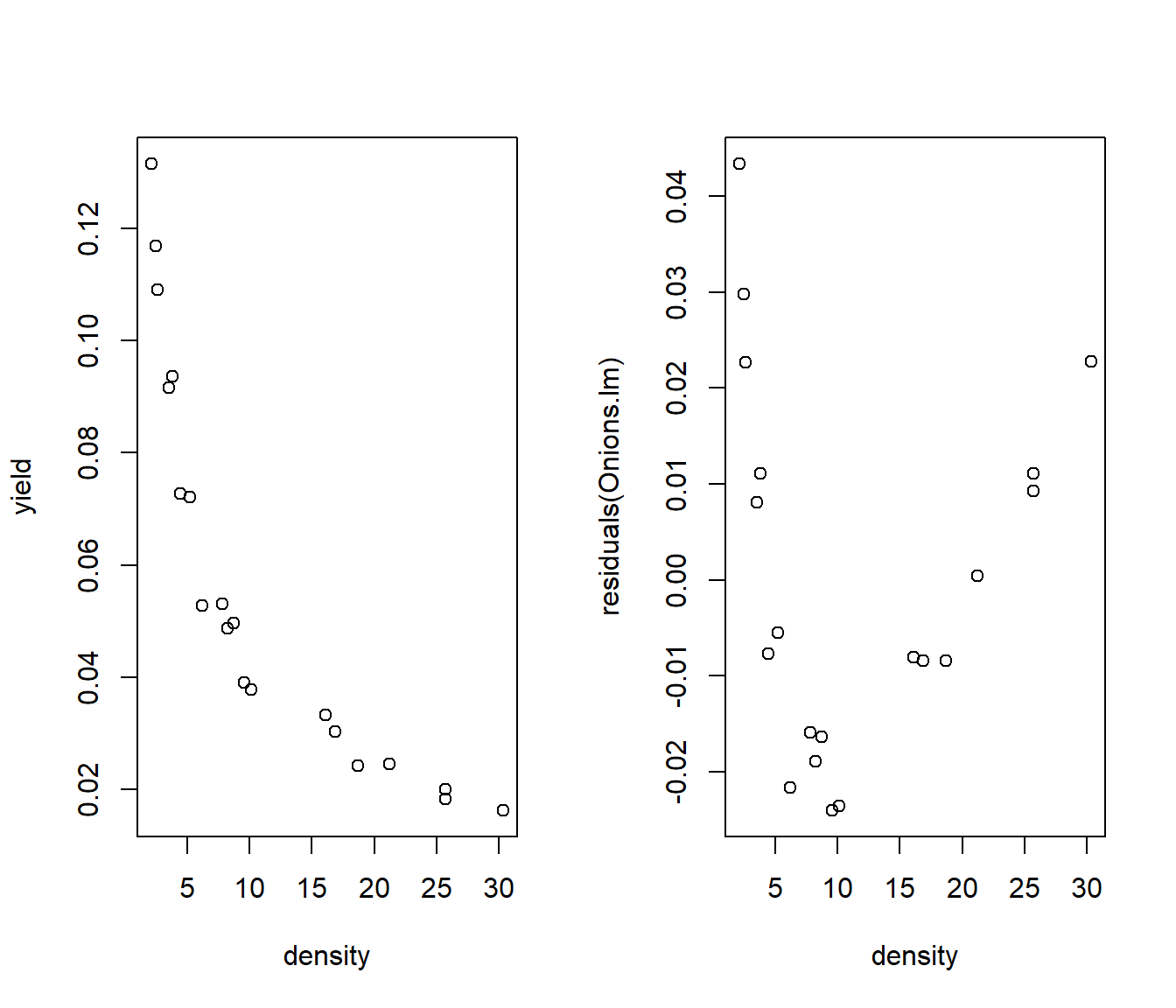
The fitted line plot and residuals both show curvature.
So we need to try a transformation. We will begin by looking at the ladder of powers.
37.2 Ladder of powers
This refers to transformations of the form \(y^p\) or \(x^p\) for some power p.
Usually we restrict ourselves to multiples of \(\frac12\) for p, but we don’t strictly have to
\(p=3 \longrightarrow y^3\) cubing
\(p=2 \longrightarrow y^2\) squaring
\(p=1 \longrightarrow y^1\) untransformed
\(p=0.5 \longrightarrow y^{0.5} = \sqrt{y}\) square root
\(p=0 \longrightarrow \log(y)\) natural logarithm
\(p=-0.5 \longrightarrow -1/\sqrt{y}\) reciprocal square root
\(p=-1 \longrightarrow -1/y\) reciprocal
The p=0 case is an ‘odd man out’ in that \(y^0 \equiv 1\) for any value of y. But \(\log(y)\) takes its place in the ladder. The multiplication by minus one for negative powers is not essential, but it keeps points that were on the right of the original graph still on the right, and those on the left of the original graph still on the left.
As we move up the ladder of powers, data become increasingly right-skewed.
As we move down the ladder, data become increasingly left-skewed.
So if we start with right-skewed data, then going down the ladder of powers will massage the data towards symmetry.
37.3 Onions example
Log-transforming y or x separately doesn’t seem to fix the curvature.
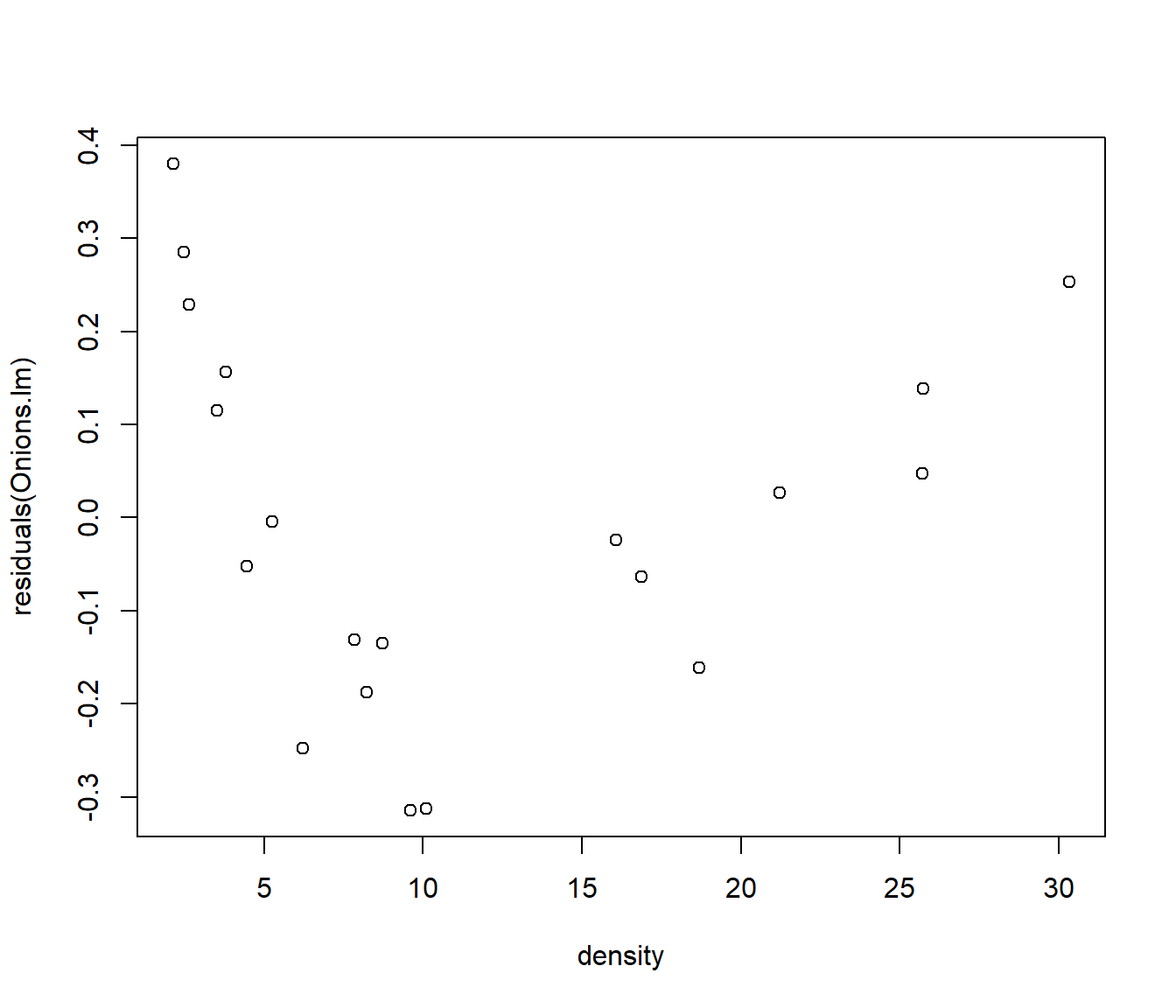
A reciprocal transformation of y seems to give us a straight line, but the residuals show heteroscedasticity - the cluster of points on the left of the residual plot (density<5) have much smaller (vertical) spread of residuals.
par(mfrow = c(1, 2))
Onions.lm = lm(1/yield ~ density, data = Onions)
plot(1/yield ~ density, data = Onions)
plot(residuals(Onions.lm) ~ density, data = Onions)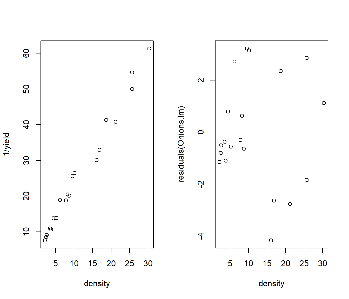
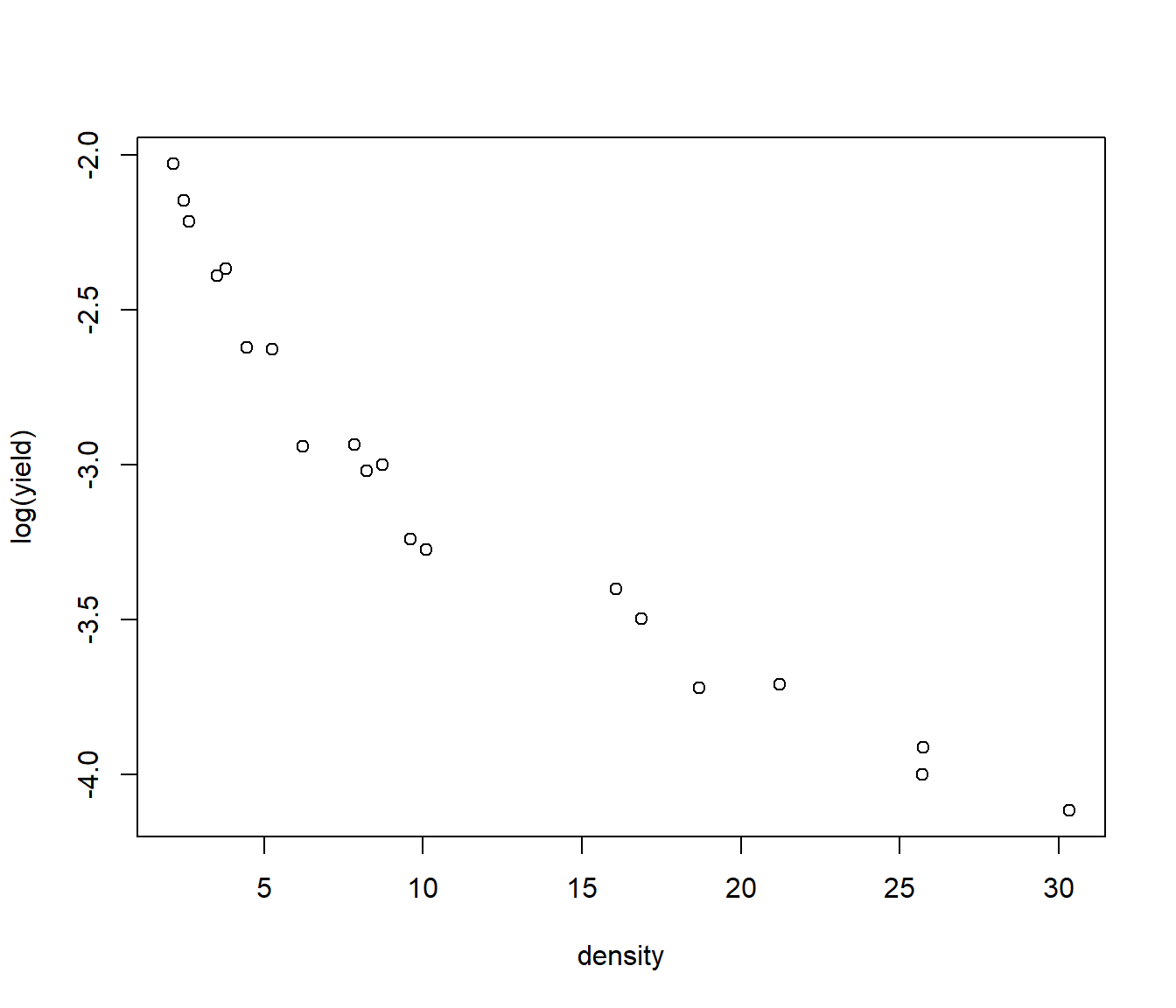
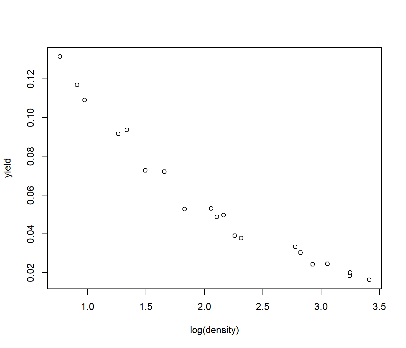
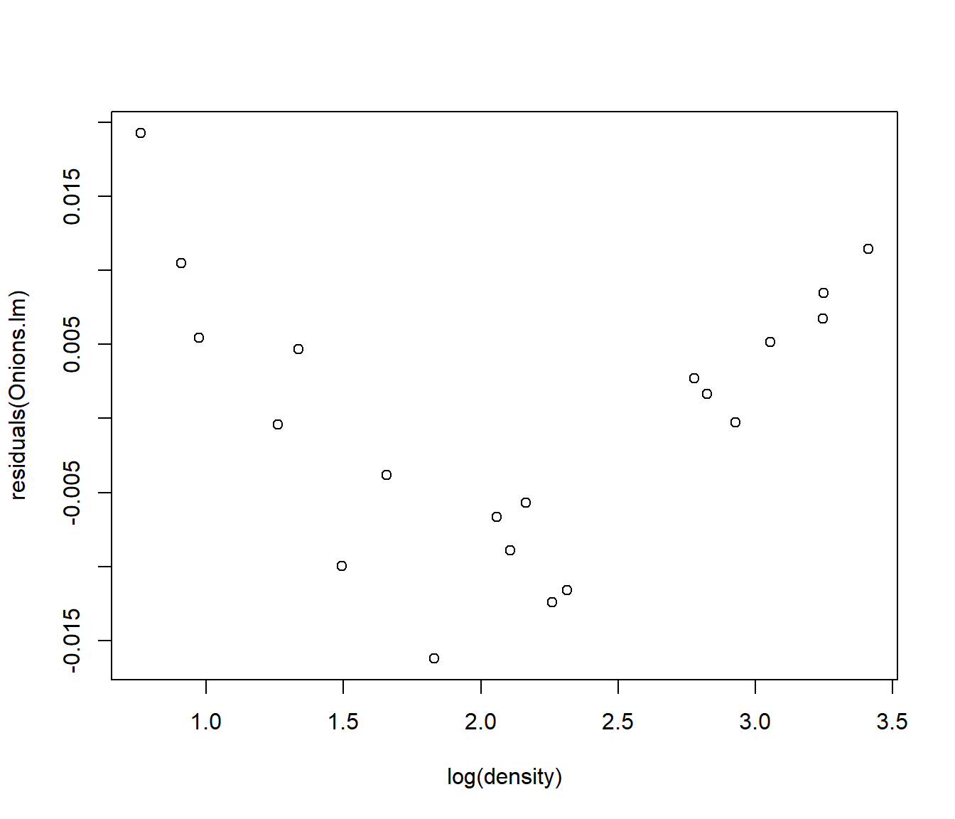
Transforming both x and y does the job. The curvature is fixed and the residuals, though not perfect, are more even.
par(mfrow = c(1, 2))
Onions.lm = lm(log(yield) ~ log(density), data = Onions)
plot(log(yield) ~ log(density), data = Onions)
plot(residuals(Onions.lm) ~ log(density), data = Onions)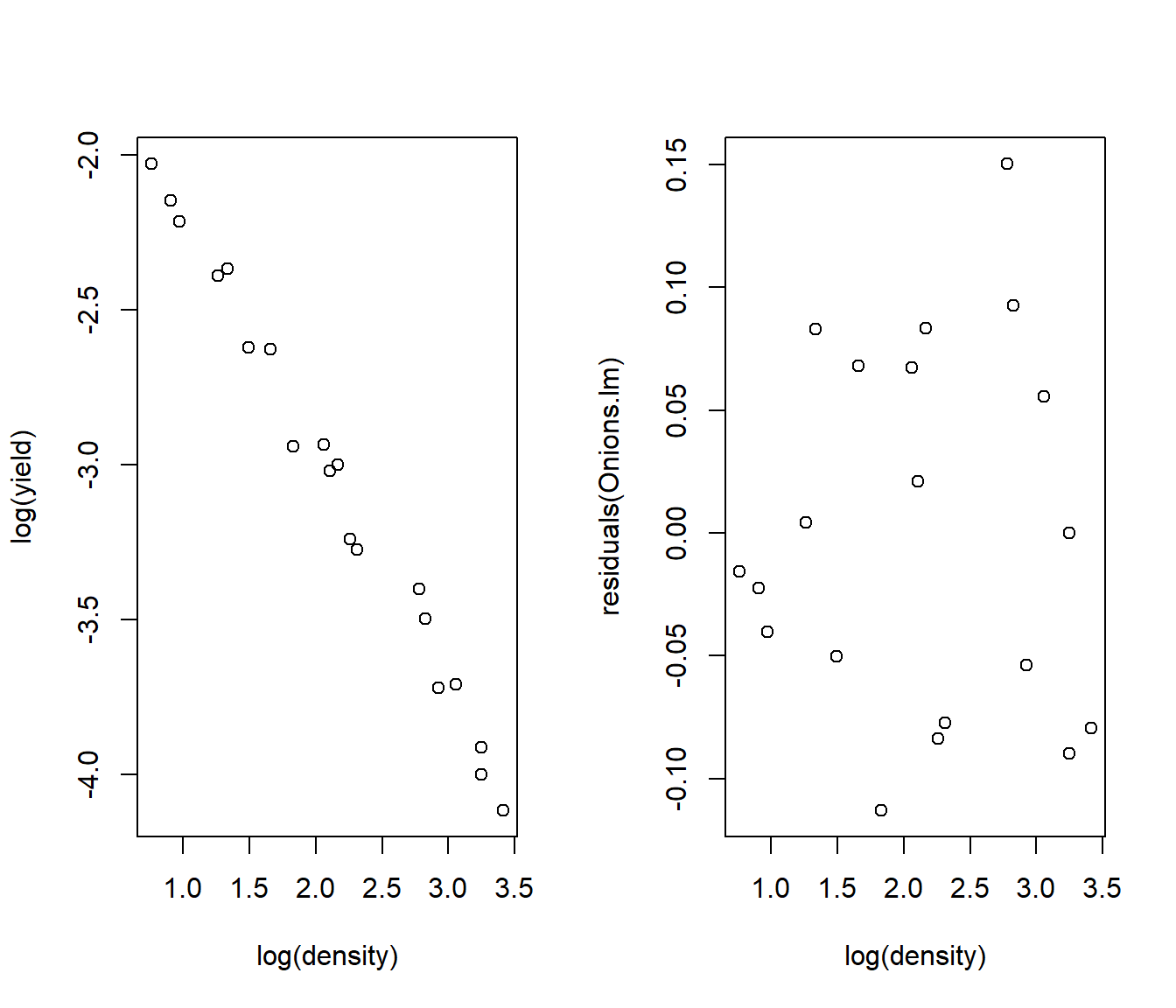
37.4 Interpreting different transformations
Suppose \[ y = A x^b \eta \] where \(\eta\) refer to multiplicative errors. This formula describes a lot of phenomena with rapid growth (b>1), diminishing-returns growth (\(0< b<1\)), or reciprocal-type decay \(b <0\).
Taking logs of both sides of the equation gives \[log(y) = log(A) + b log(x) + log(\eta)\] which we can rename as \[Y_{new} = \beta_0 + \beta_1 X_{new} + \varepsilon\]
for \(\beta_0= log(A)\), \(\beta_1=b\), and \(\varepsilon= log(\eta)\).
So if we plot \(log(y)\) against \(log(x)\) and get a straight line with constant spread of errors, we can conclude that the model \(y = A x^b \eta\) was correct. We can predict the values of \(y\) by back-transforming the predicted values; \[\hat y = e^{\hat Y_{new}} = \exp(\hat Y_{new}).\] The residuals in the original scale are \(e = y - \hat y\).
Similarly if \[ y = C e^{ bx}\eta = e^{ a+ bx + \varepsilon} \] (Exponential growth or decay) then a plot of \(log(y)\) against \(x\) should yield a straight line with constant spread of errors.
Suppose on the other hand we have a model \[\sqrt y = \beta_0 + \beta_1 x + \varepsilon ~~.\] The predicted values of \(y\) are \[\hat y = \left( \hat\beta_0 + \hat\beta_1 x\right)^2\] and we can calculate the residuals in the original scale as \(e = y - \hat y\). (Of course if the errors are normal on the \(\sqrt y\) scale they will not be normal on the ordinary \(y\)-scale. )
37.5 log transform as a model for percentage change
We consider the following data on the number of subscribers to cellular phones in the USA, from the mid-1980s. The number of subscribers is given at 6-monthly intervals (see the variable “Period”). A plot of Y=Subscribers versus x=Period gives a curve. Note this is clearly a time series, and so adjacent time points will not be independent, which violates one of the assumptions of regression modelling. However we will ignore this fact for the moment, so we can see what happens.
  Period Month Year Subscribers
1      1    12 1984       91600
2      2     6 1985      203600
3      3    12 1985      340213
4      4     6 1986      500000
5      5    12 1986      681825
6      6     6 1987      883779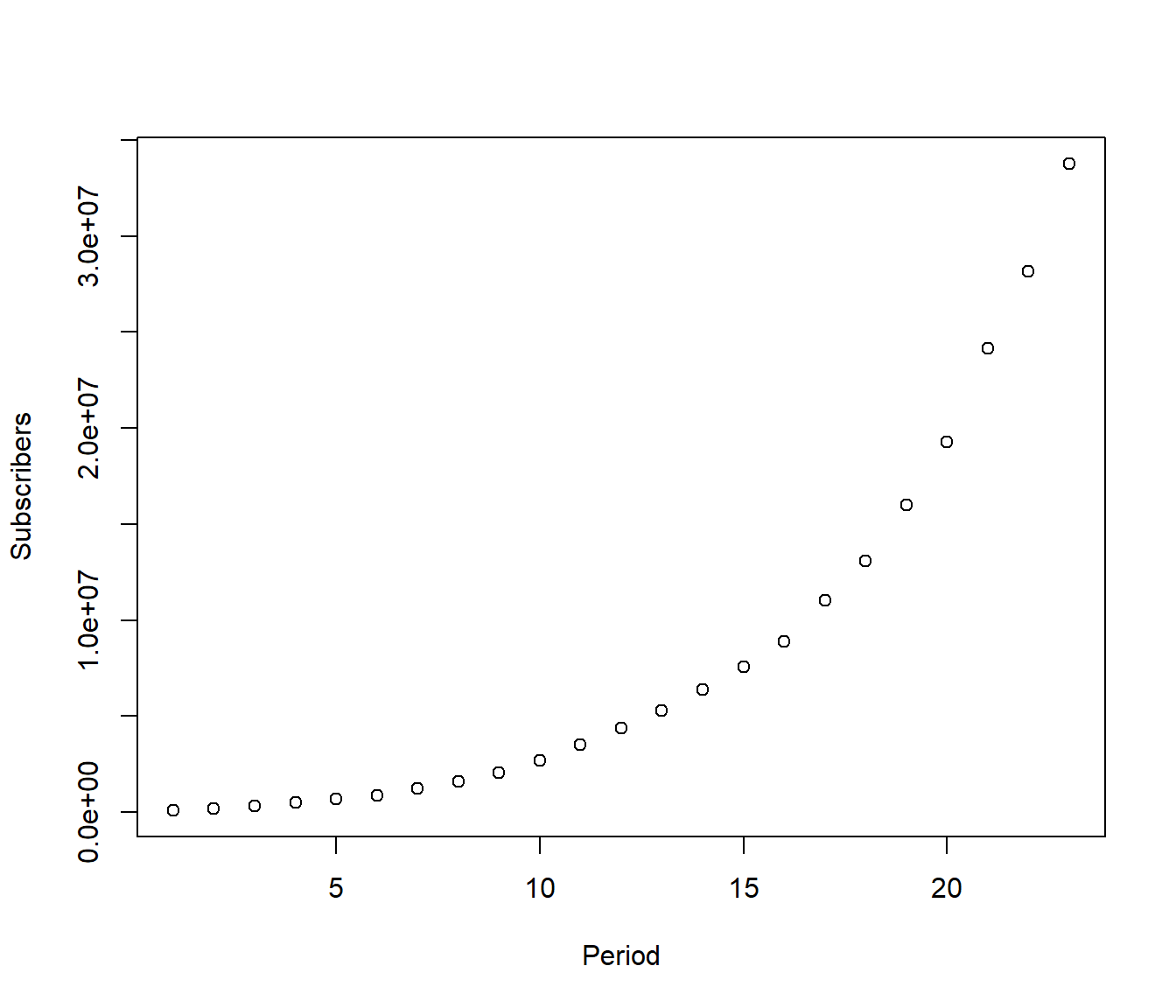
This looks like an exponential growth model \[E[ Subscribers] = S_0 e^{\beta_1\times Period } \]
where \(S_0\) is the number of subscribers at \(Period=0\) and \(\beta_1\) is a growth rate indicating how fast the number of subscribers is growing in powers of \(e= 2.71828\). For example if \(\beta_1 = 0.02\) then the number of subscribers is expected to grow to \(e^{0.02}=\) 1.0202 the size it was before, i.e. a 2.02% increase.
Now we try a log transformation. If my guess of the model is correct, then a plot of log(Y) versus x should give a straight line. In fact, the reverse argument is also true : if we get a straight line, then we know the exponential growth curve was correct.
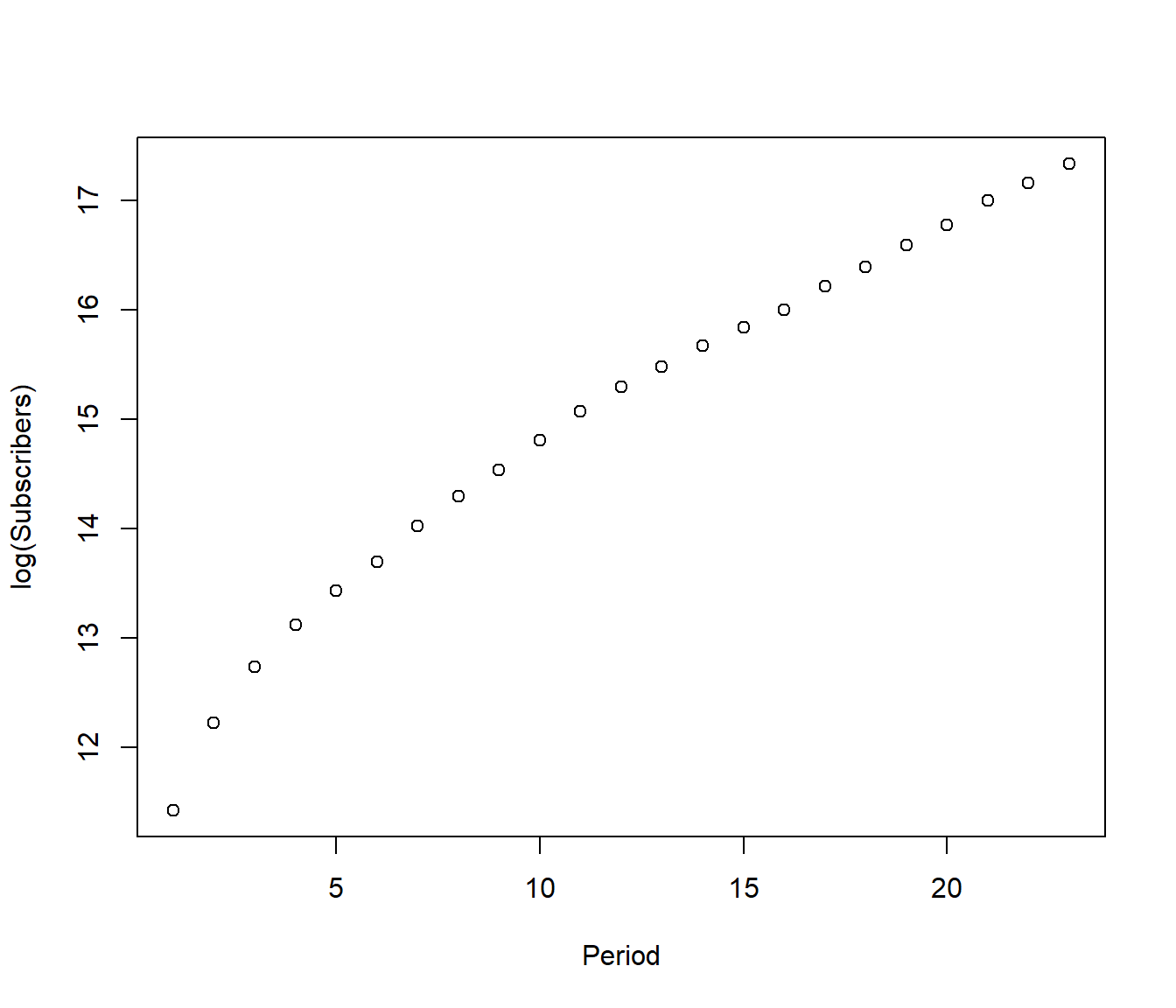
OK so clearly it is not a straight line, but reflects different parts of a products market cycle: initially few people had cell phones so any increase seemed rapid. But later, after about \(Period=10\) the market for cell phones was maturing and the increase seems about linear.
Since it is more important to predict the future than the past(!) let’s drop the early data and see if we get a good model for \(Period\ge 10\).
Cellular2 = Cellular |>
    filter(Period > 9)
Cellular2.lm = lm(log(Subscribers) ~ Period, data = Cellular2)
plot(residuals(Cellular2.lm) ~ Period, data = Cellular2)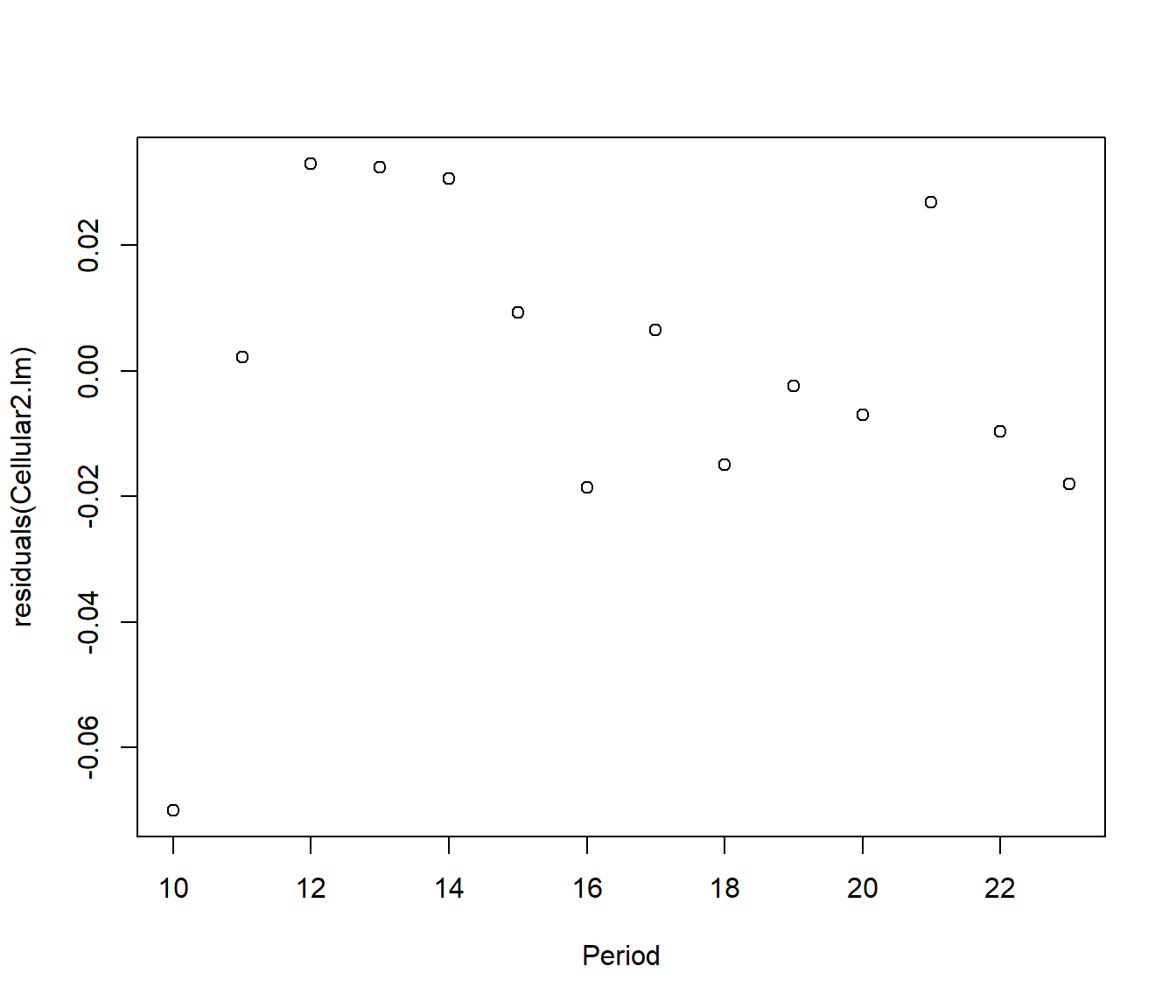
The points now look close to a line, except the first one. This point also stands out among the residuals. We will try deleting this one more point.
Cellular3 = Cellular |>
    filter(Period > 10)
Cellular3.lm = lm(log(Subscribers) ~ Period, data = Cellular3)
plot(residuals(Cellular3.lm) ~ Period, data = Cellular3)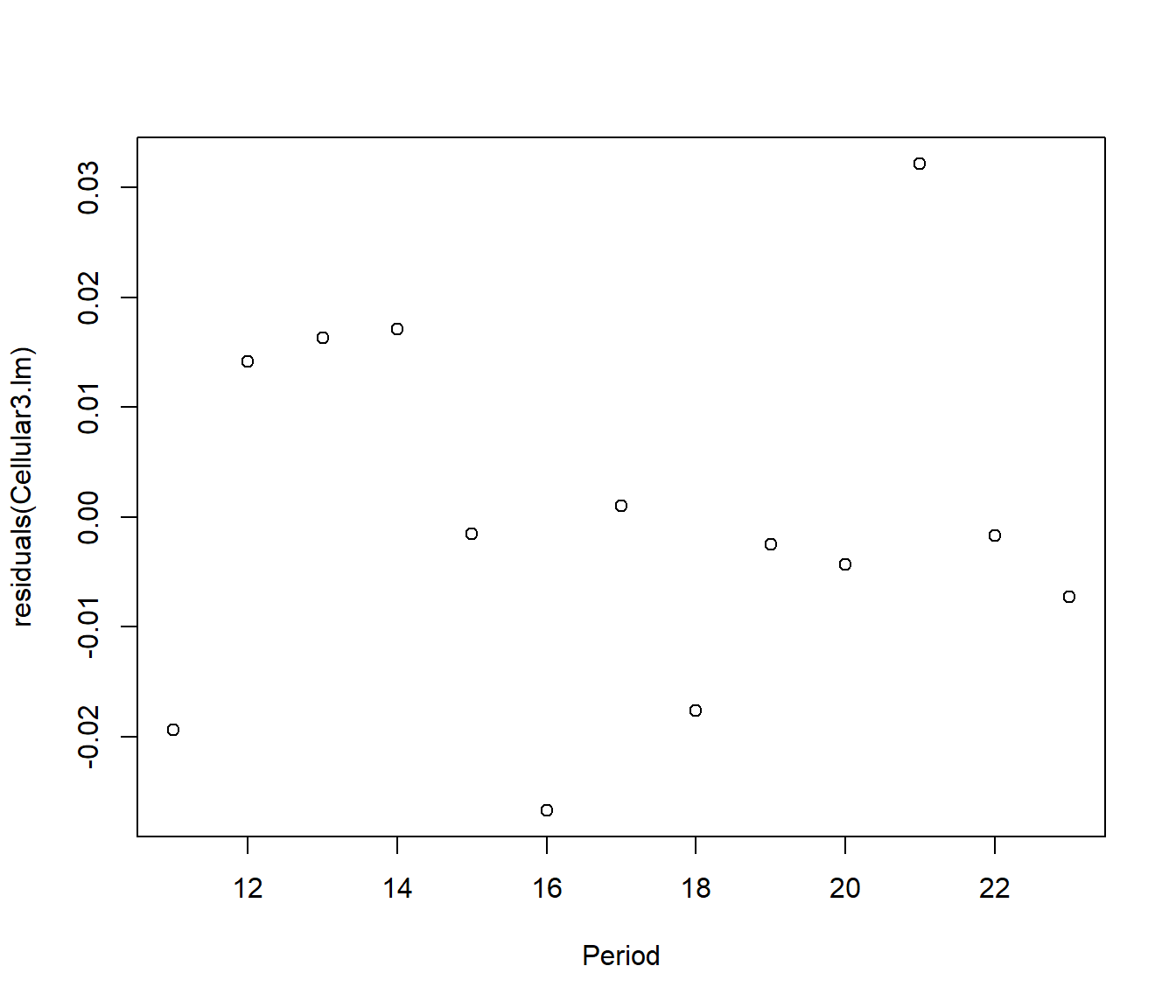
The residuals now look patternless, so we will declare it a good model. The line is \[\hat {log(y)} = exp(13.020897 + 0.187908 x) = 451755.8 e^{0.187908 x} \]
Substituting x = 23, (the last period in the dataset) the fitted number of subscribers was 34030866 (only a 0.73% difference from the observed value of 33785661).
To predict for the next time period, we would substitute x=24.
Putting it another way, since
\[\hat Y_{24} = 451755.8 e^{0.187908\times (23 +1)} = \hat Y_{23} \times 1.206722 \]
we can summarize by saying that we expect a 20.7% growth in the number of cell phone subscribers in the next 6 months.
This calculation highlights the following important fact: a linear model for log(Y) corresponds to a model for percentage growth (or percentage decline)
This is a major reason why the log transform is used a lot in economic data, as so many measures of growth are given in percentage terms (e.g. interest rates).
37.6 Transformations for Count data (Extension work)
This section looks at Transformation To Constant Variance (Correcting Heteroscedasticity)
We have seen that heteroscedasticity (unequal spread) can arise because the errors occur on a different scale to the one we have measured on (e.g. the response should be measured on a log scale and if we do that then multiplicative errors become constant.) But this is not the only potential source of heteroscedasticity.
37.6.1 Binomial Data
Suppose our data are the number of ‘successes’ in a set of n independent trials. For example Y might be the number of people answering “yes” to a question, or the number of stocks of a certain type that show a rise in response to a news event. We call such data “Binomial” . The assumption of independent trials refers to the idea that the outcome from one person (or one stock) does not in itself affect the outcome from any other person (or stock). It turns out that some mathematical theory suggests we transform using \[ Y_{new} = sin^{-1}(\sqrt y )\]
Here \(sin^{-1}\) is the inverse sine transformation (or arcsine) that you may remember from trigonometry in your high-school maths course.
This approach has fallen out of fashion in the 21st century because of development of methods called “generalized linear models” that work with Binomial models directly.
37.6.2 Poisson Data
This is another mathematical model used for data consisting of counts, but in this case where there is no fixed upper limit on the number of responses one might obtain (contrast to the Binomial, where the \(Y \le n\)).
For example we may be counting the number of customers responding to an advertisement. Then for practical purposes we cannot stipulate a maximum Y (or at least only a very large maximum, such as the population of a country, and we don’t expect the data to go anywhere near that value. )
It is again assumed that the events counted happen independently of each other (e.g. people make up their own minds whether or not to be customers).
A mathematical characteristic of Poisson data is that the mean and variance are equal. We write this as \[ E[Y] = \mu = \mbox{Variance}(Y) ~~,\]
where\(\mu\) is the average rate of events per unit time (e.g. customers per day).
Putting it in terms of the standard deviation of Y, \(sd(Y) = \sqrt Y\).
Some mathematical theory suggests that we should be able to stabilise the variance of Poisson data by analysing the transformed data \(Y_{new} = \sqrt Y\) (or \(\sqrt{Y+1}\) if the Y values are small). The latter was the transformation used to fit the data on mountain-climbing fatalities on Mt Everest, in Topic 08.
37.6.3 Negative Binomial
If the data are the result of counting events which are not independent, but exhibit clustering (so that the rate at which the random events occur seems to vary from time to time), then a mathematical model that may be suitable is called the Negative Binomial distribution.
For this type of data, sometimes called “clustered Poisson”, the variance tends to be bigger than the mean (\(\mu<\sigma^2\)). A common practice is to transform the response to \(Y_{new} = log(1+Y)\) or sometimes \(log(0.5+Y)\).
37.6.4 Example: How many magazines do you read?
We consider some data on the number of magazines read by a sample of New Zealanders, versus their education level (variable “Educgrp”). The data were generously provided by a market research company, AGB McNair. Randomly selected respondents were shown the covers of a number of popular magazines (e.g. Women’s Weekly) and were asked whether they had read those issues. We deal here with the total number of magazines read. Educgrp is a categorical variable, with levels
1= Primary School only
2= Secondary School but no NCEA or School Certificate
3= NCEA level 1 / School Certificate
4=NCEA level 2 or 3 / University Entrance or Bursary
5=Technical or Trade Qualification
6=Other Tertiary (not university)
7=University Qualification
8=Studied at University but not completed
The following Boxplot shows the number of magazines read for each level of Educgrp, with error bounds. The medians seem to show a weak upward trend, but the graph is swamped by so many outliers.
  Mar.Stat Educgrp Gender Agegrp Ethnicty SES PersIncm FamIncm Y1 Newspaper
1        1       3      2     15        2   4        4       6  3        12
2        1       7      2     14        8   1        1       5  4         0
3        1       5      2     14        2   3        1       3  4         0
4        2       2      2      6        2   4        1       8  3         5
5        1       7      1     13        2   2        4       5  1         6
6        3       2      1     15        2   2        4       3  5        11
  Magazines   sqrtY3  lnMags1 AnyPaper AvidReader
1         5 2.236068 1.791759        1          1
2         0 0.000000 0.000000        0          0
3         3 1.732051 1.386294        0          0
4         3 1.732051 1.386294        1          0
5         5 2.236068 1.791759        1          0
6        11 3.316625 2.484907        1          1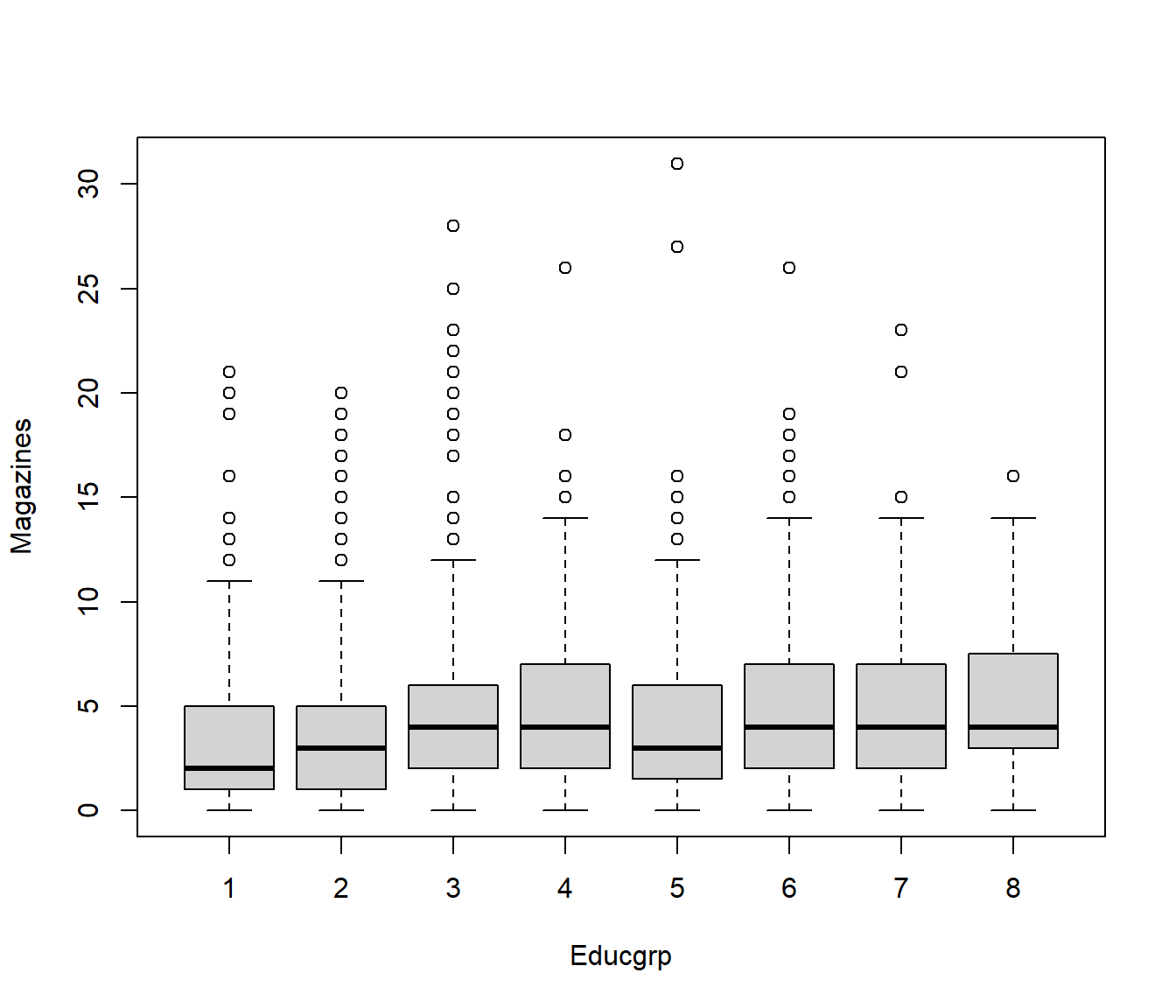
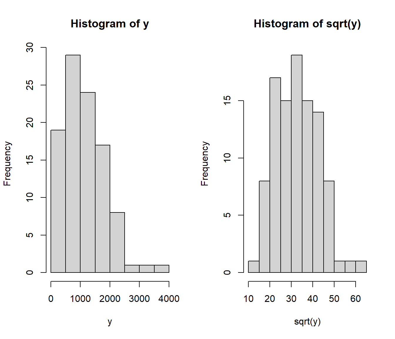
Since the number of magazines is a count, we can try the \(\sqrt Y\) and \(log(1+Y)\) transformations. Note we need the 1+ because many people read zero magazines, and we cannot take \(log(0)\).

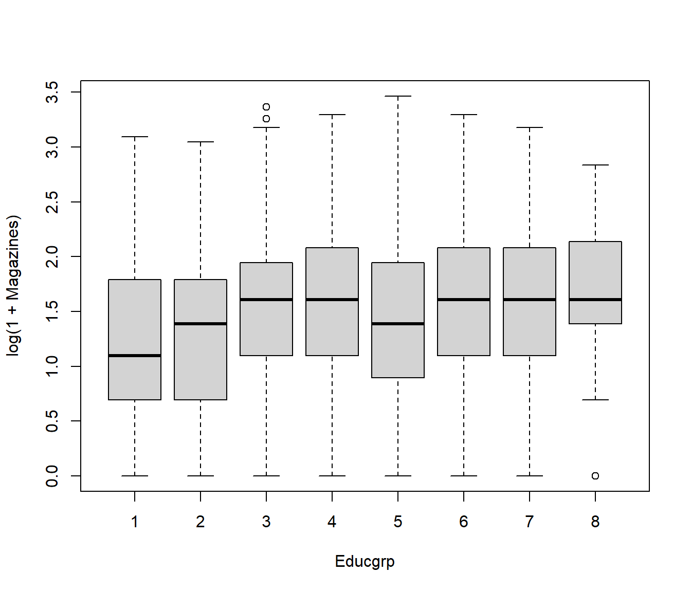
It looks as if either transformation would do, but the \(log(1+Y)\) version is slightly more symmetrical.
The pattern of medians suggests we could model the relationship between number of log(1+magazines) and education level using a nonlinear relationship, covered in another lecture.
The course 161.331 shows how to model Poisson, Negative Binomial, and other types of data using Generalized Linear Models.